Sustainable insect-based dog food online shop
Tenetrio is an online dog food store with an innovative idea; all food and snacks are made from insects and healthy vegetables and fruits. Because there are no animals in their preparation, the CO2 impact is minimal, and the water consumption is very low in this novel way helping the environment. But his sales did not accompany his good intentions. They needed to change their strategy, see the problems of the user with the online store, improve the interface, and they had to find an identity to explain their message more attractively to the user.
UX/UI Design
Conception
Digital Product Design
Branding
Creative Direction
Solution
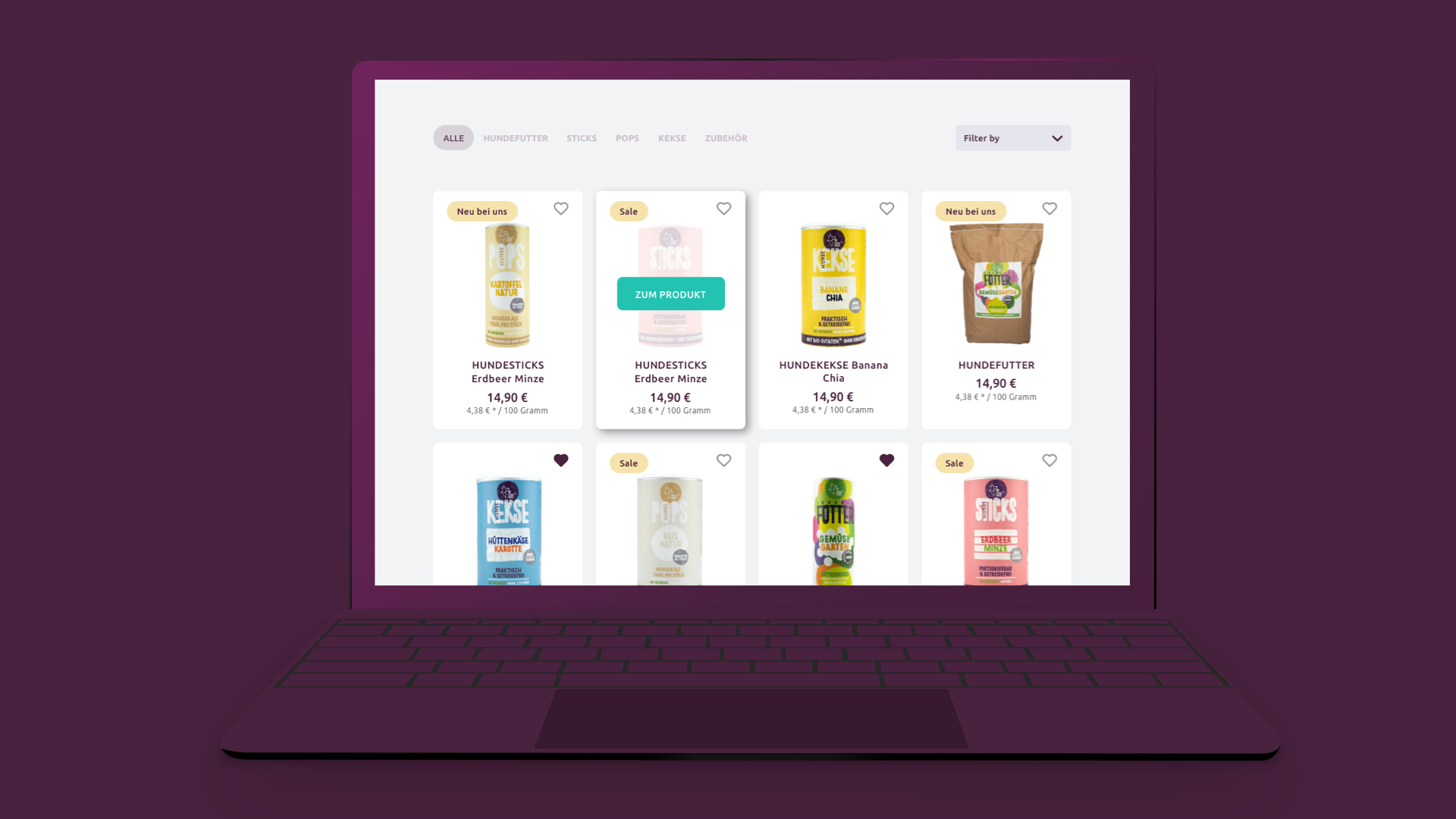
Product optimization and a new branding attractive for new users
I used different UX design techniques with current and potential users were used here to find out why the user did not finish the purchase process or what opportunities would the brand have with new customers. The results showed confusion in payment methods and a lack of information about the advantages of a product that would change the feeding habits of pets.
To perform this project I have conducted interviews and usability tests with current and potential consumers and with the results obtained I have redesigned the content and navigation of the web for desktop and mobile, design a new branding and created tools that make it easier for the user the experience with the product.
The process
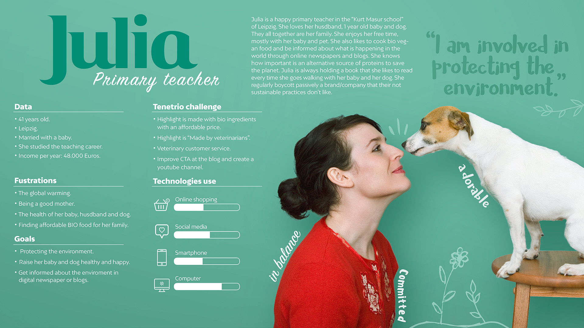
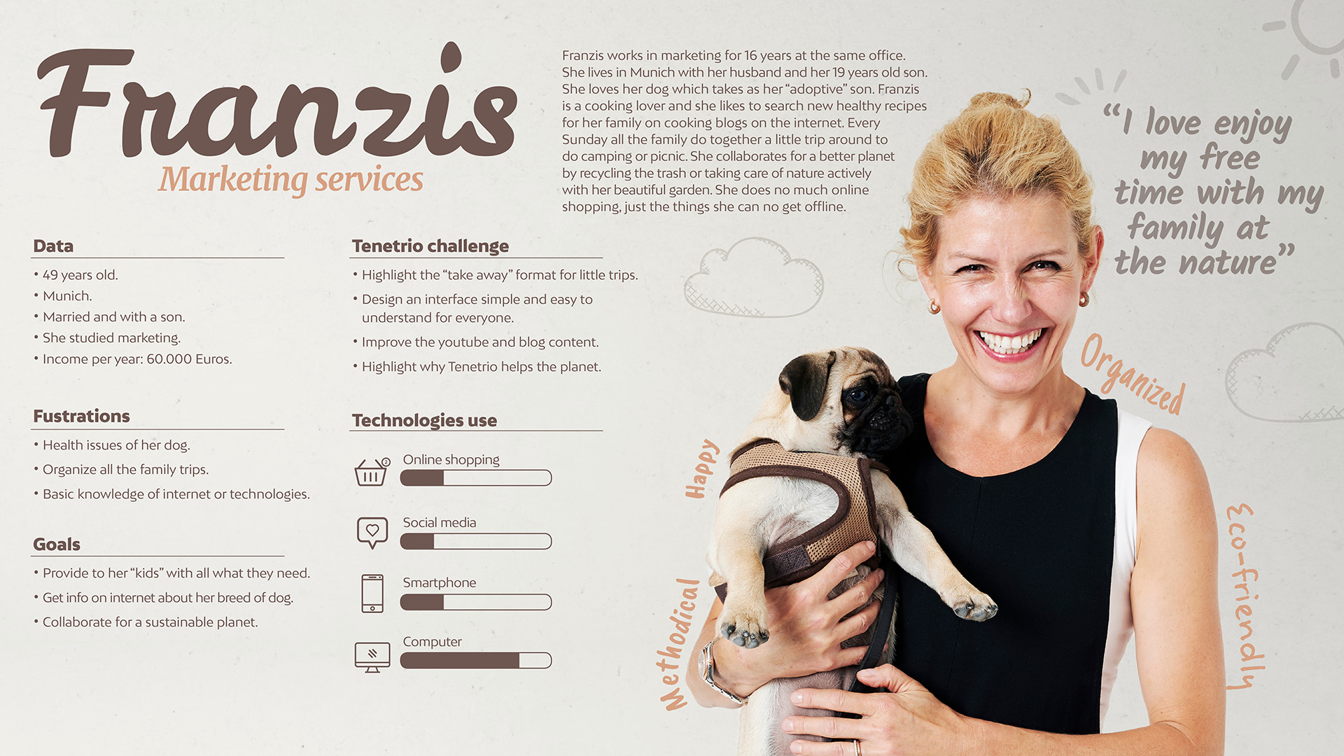
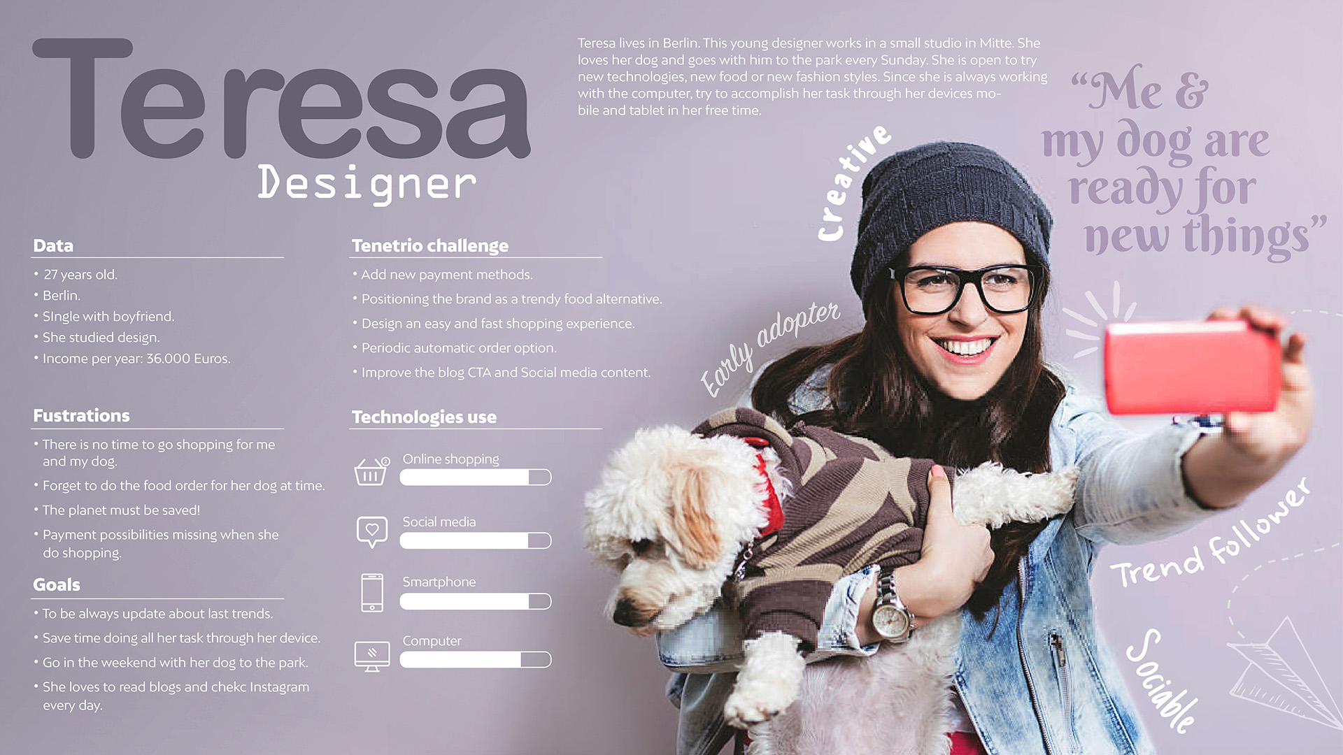
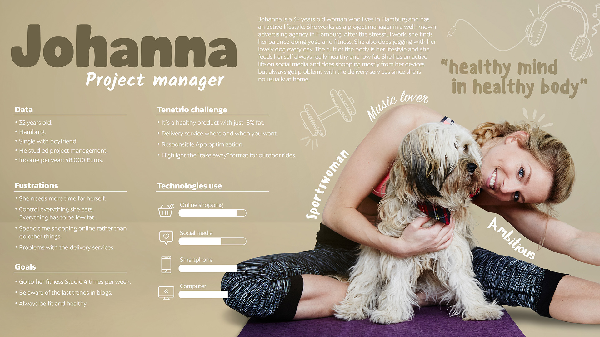
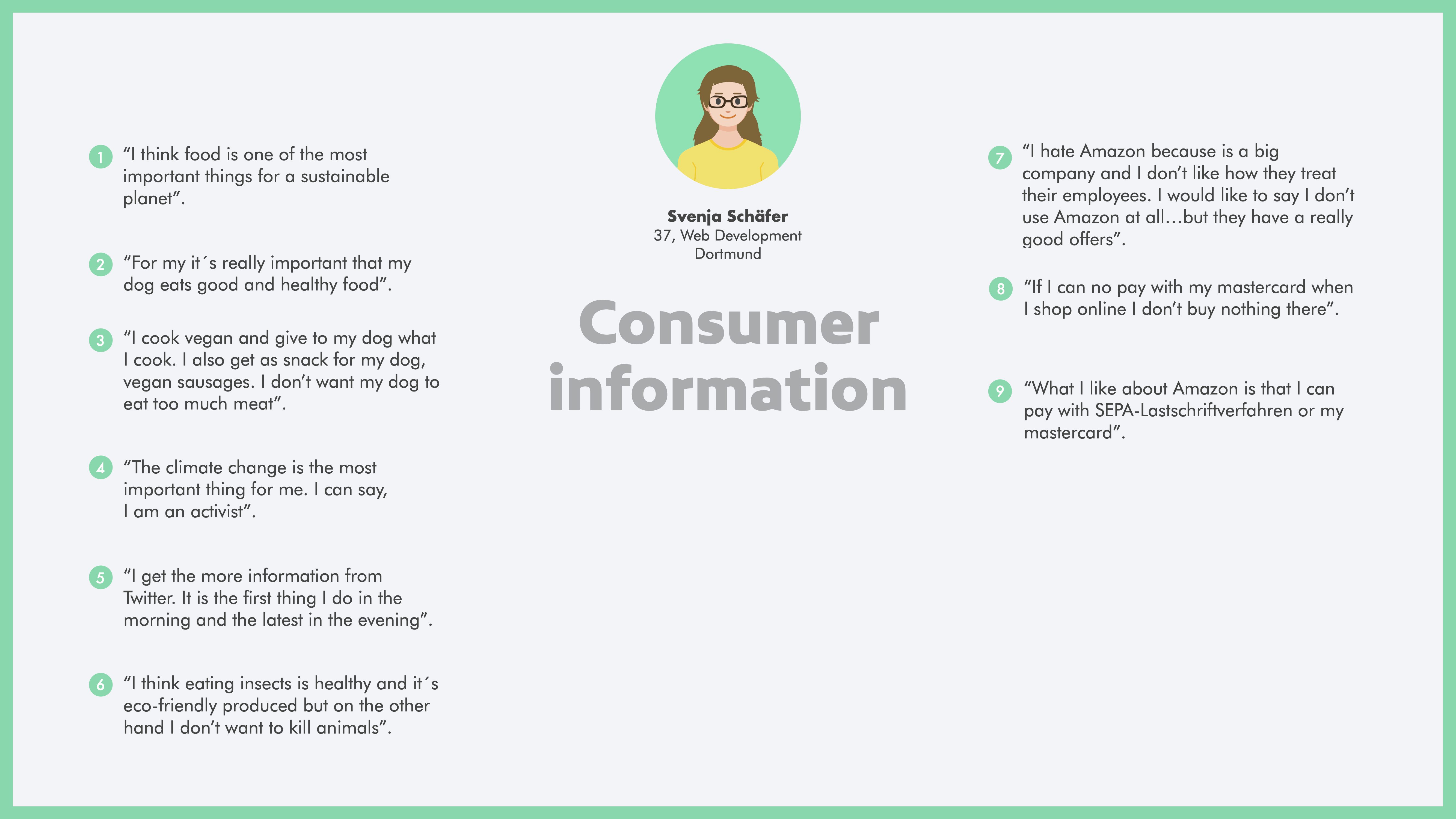
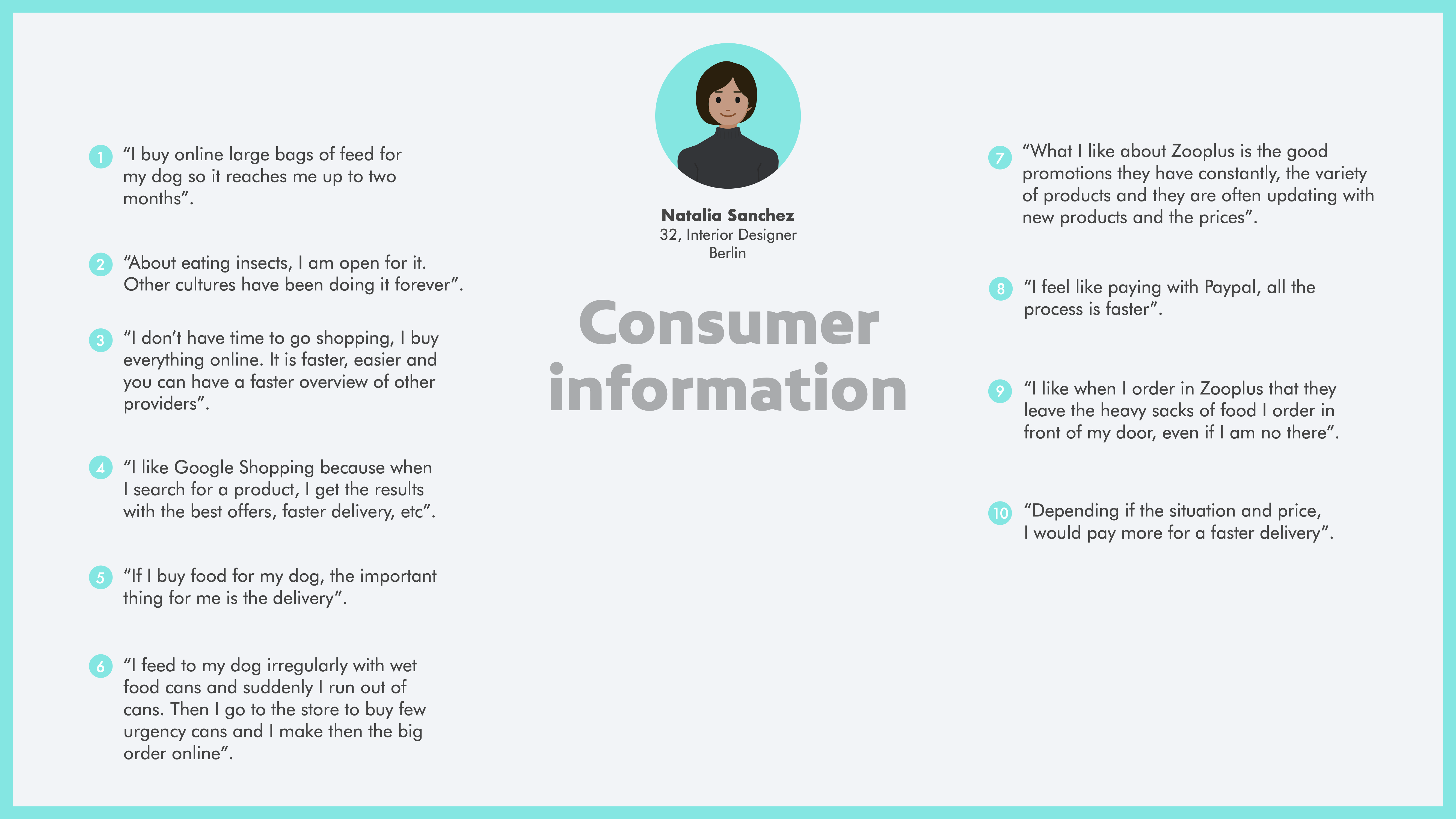
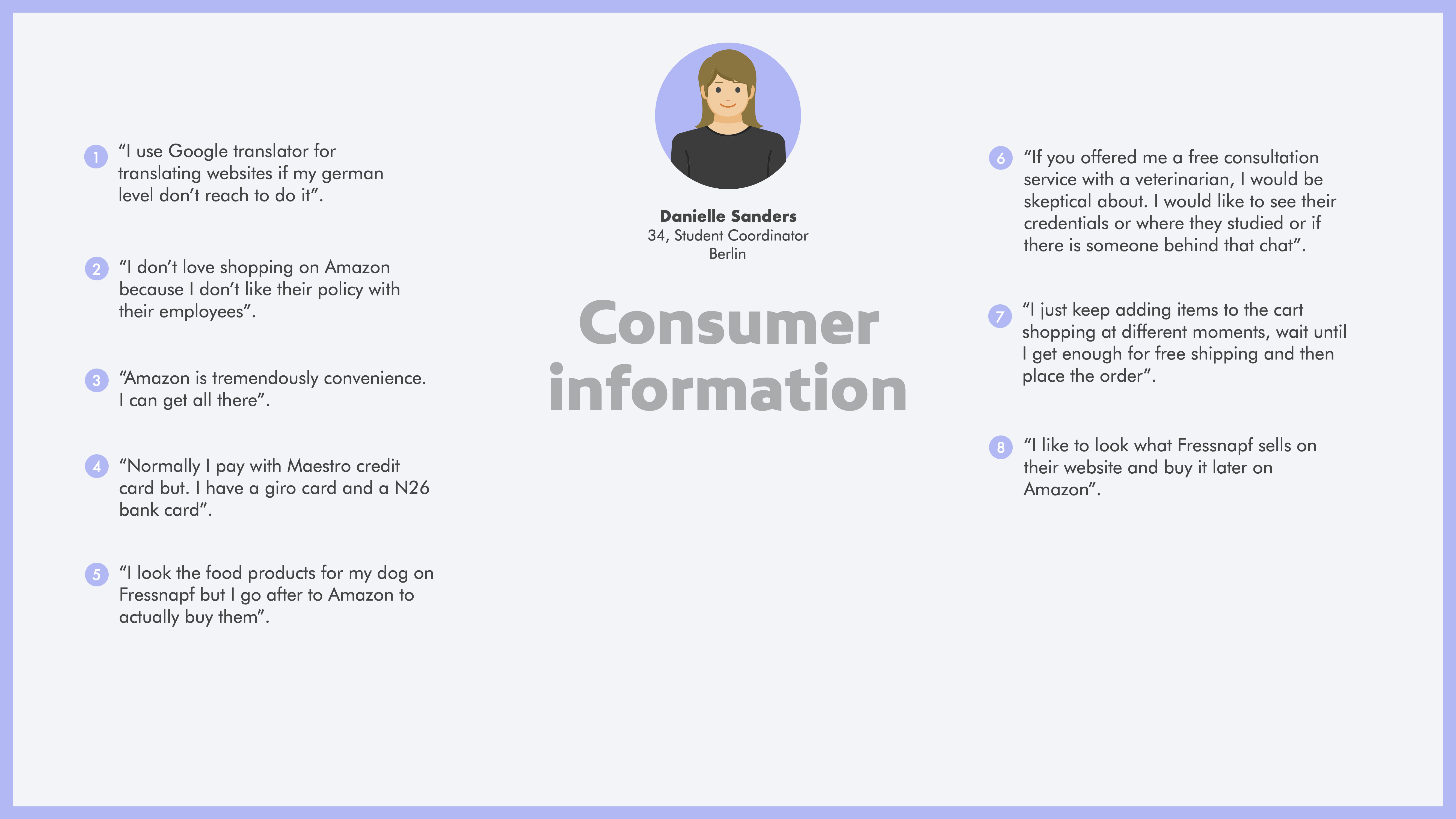
To learn about Tenetrio’s problems with its sales process and its opportunities in the market, I carry out a market study and design some User Personas to see its potential in the market.
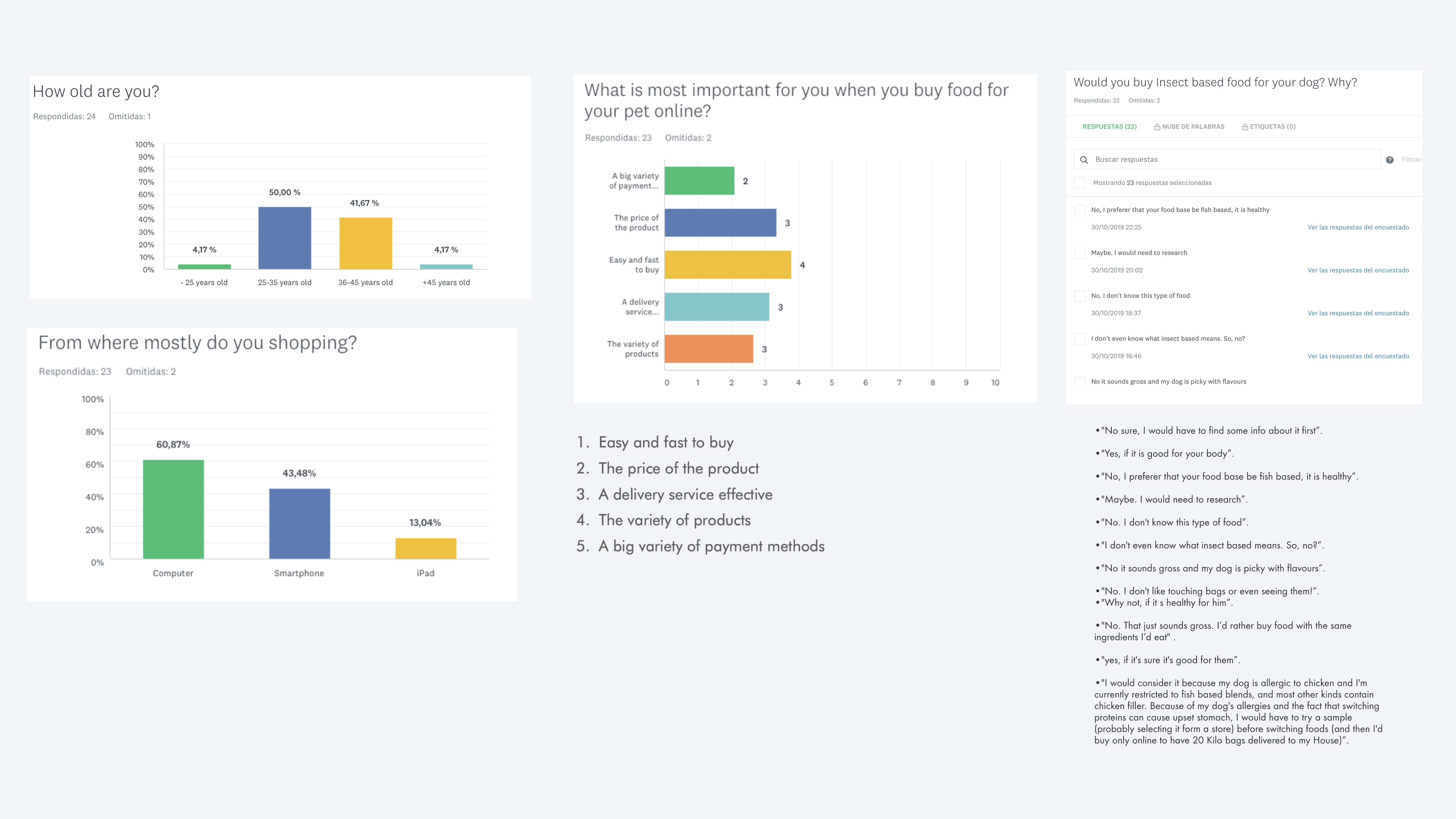
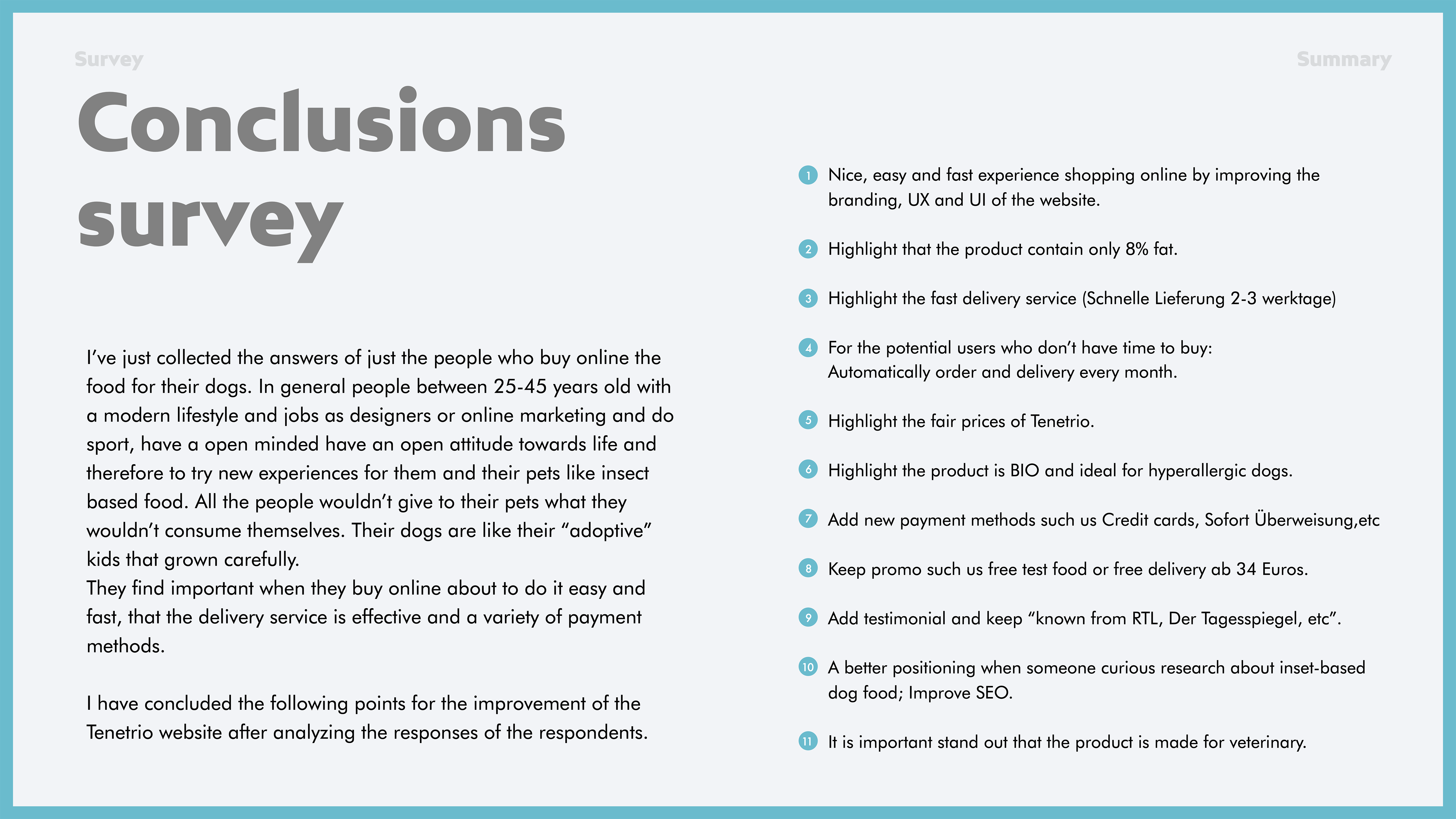
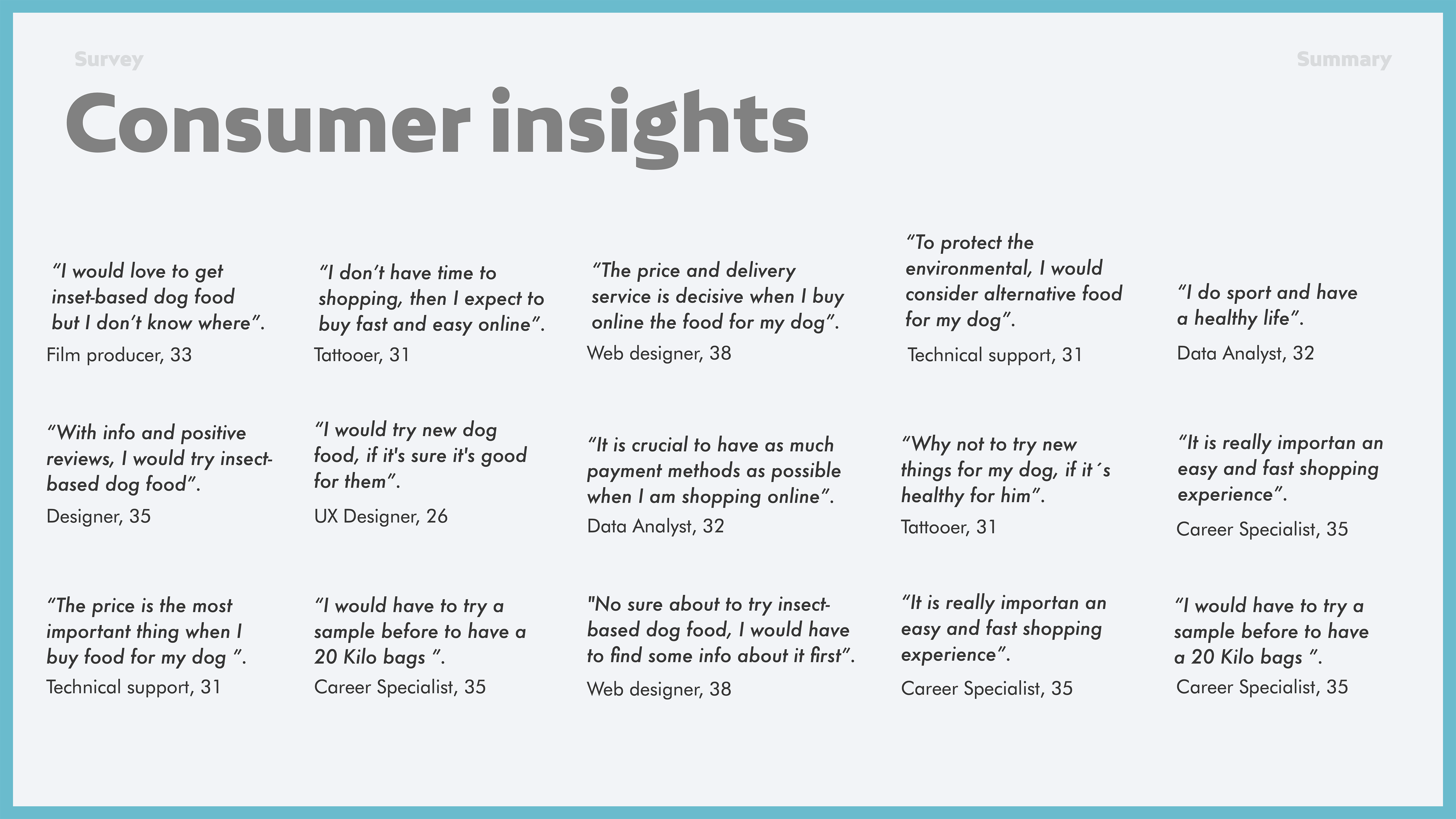
I conducted a survey to obtain quantitative data on the consumption habits of dog owners who buy food online.
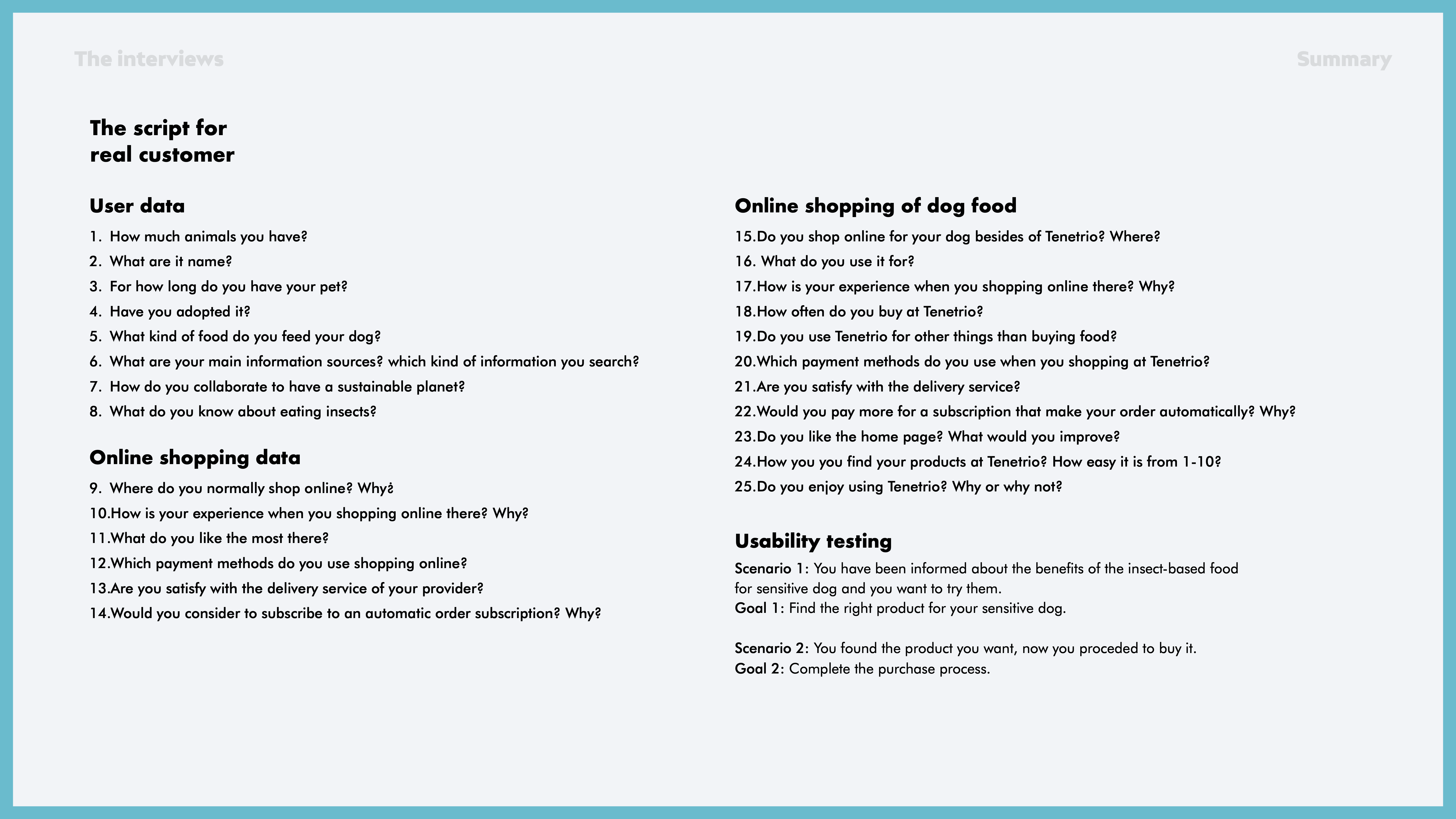
I also conducted 5 interviews and usability testing with current and potential clients.
Survey
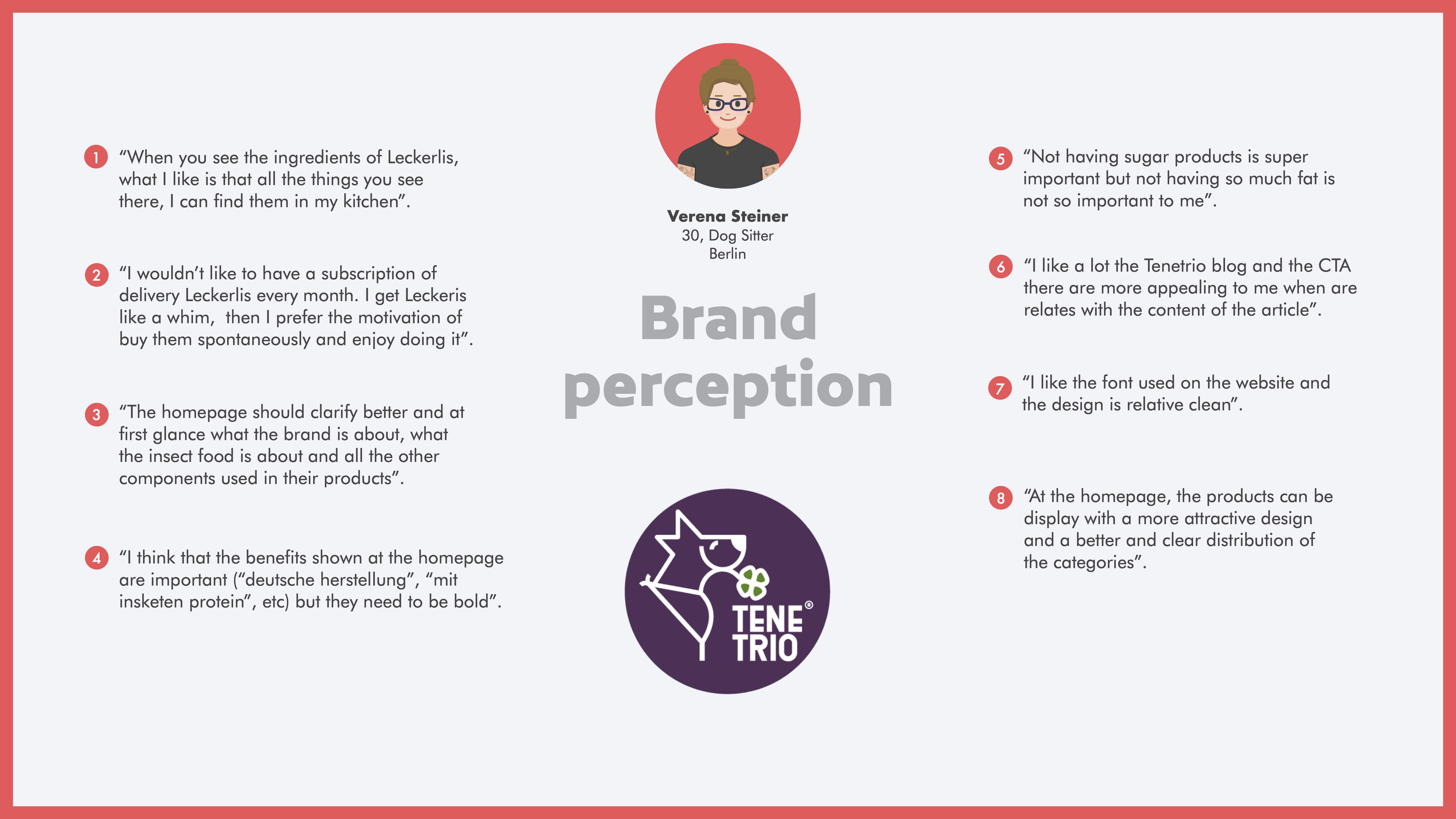
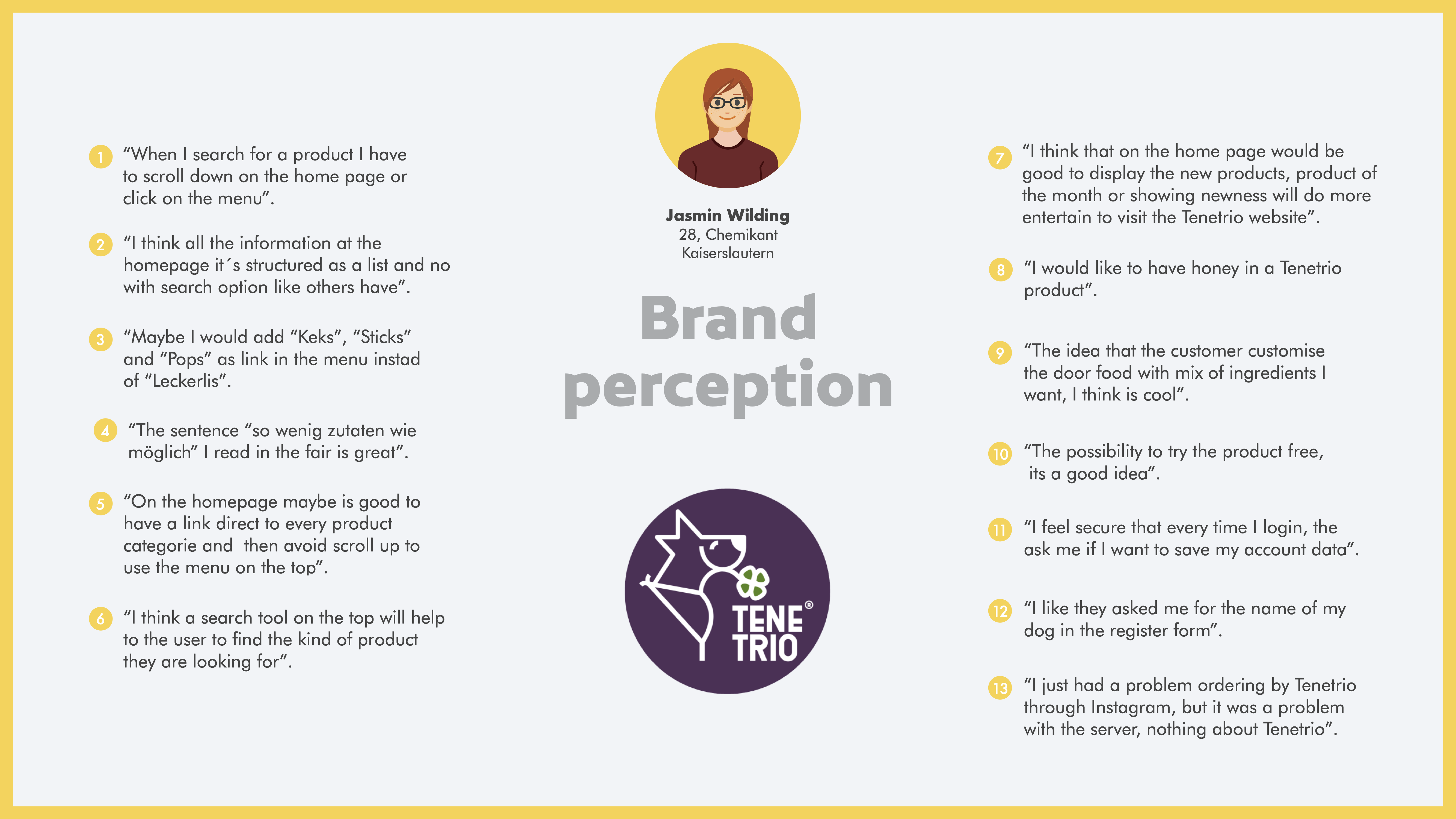
User Personas
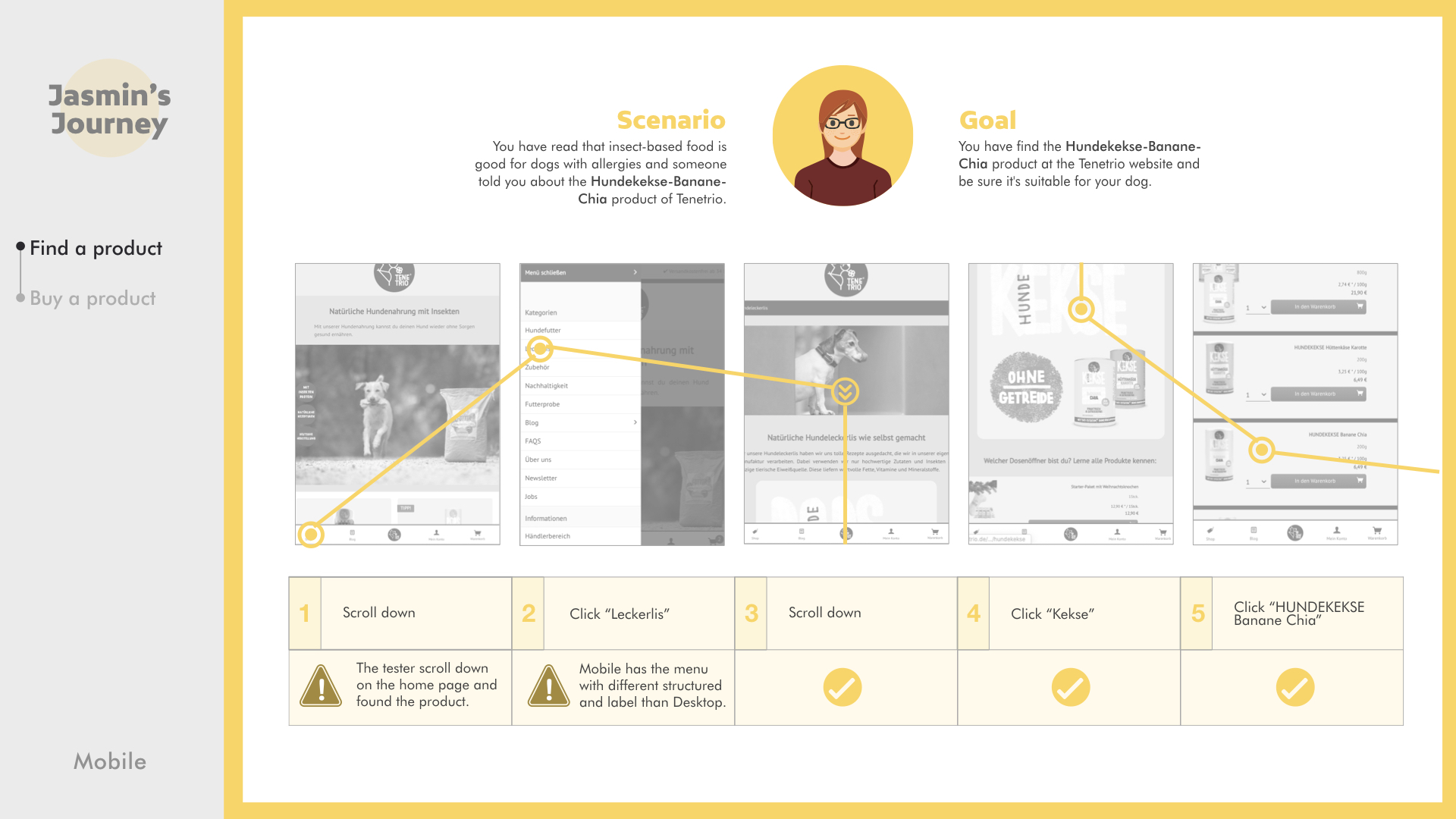
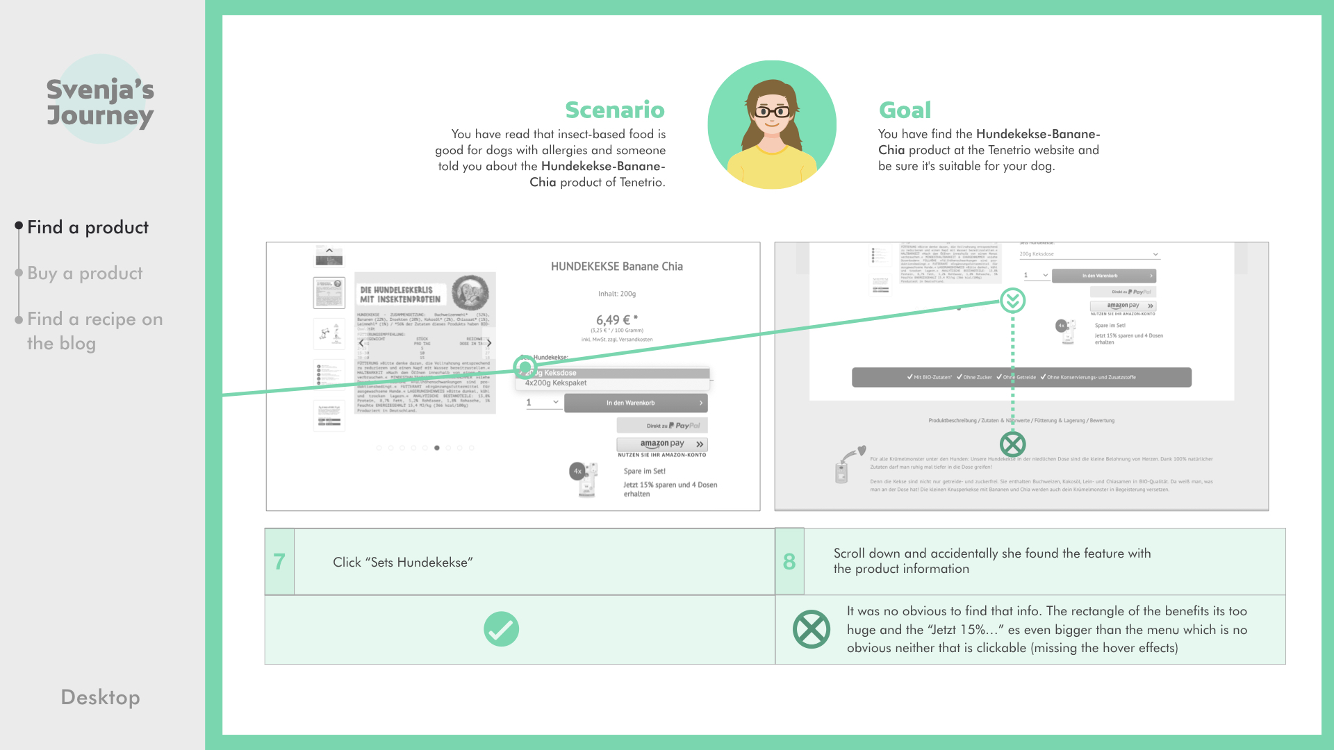
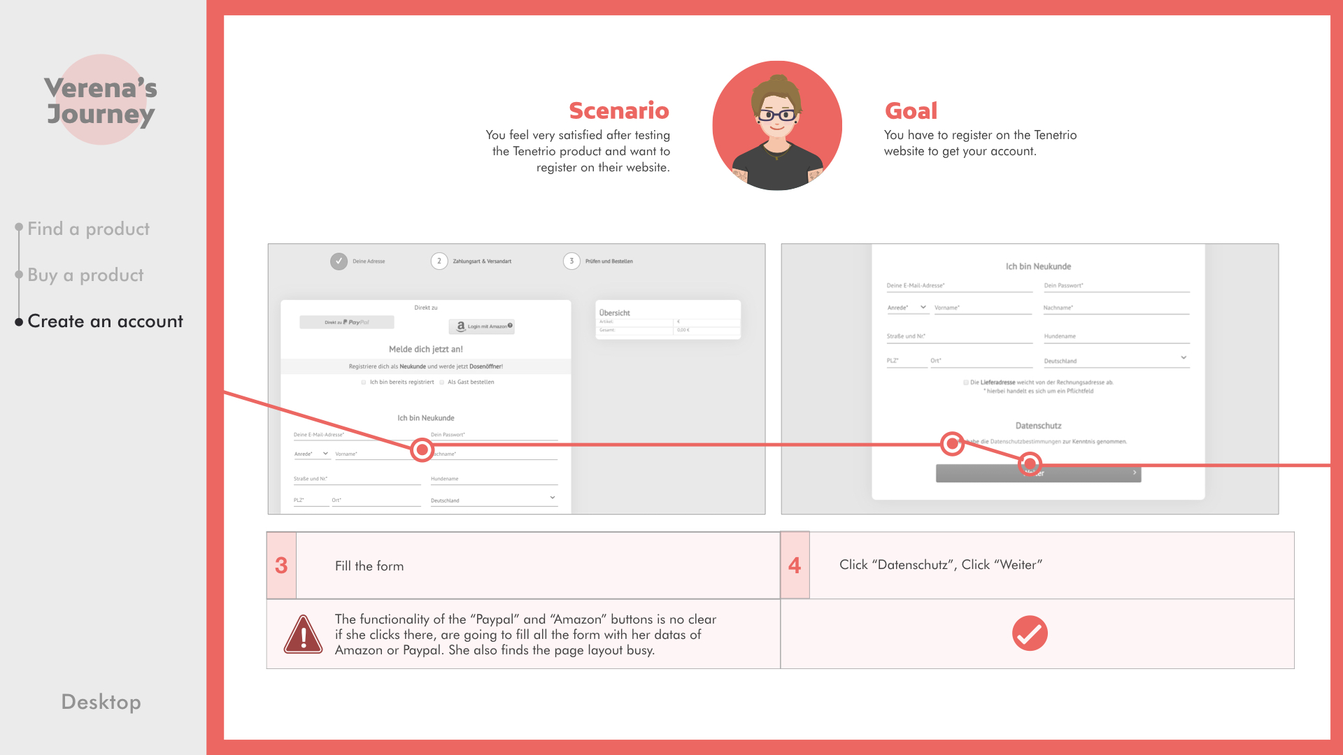
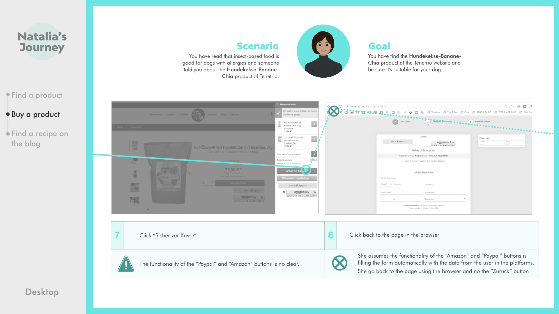
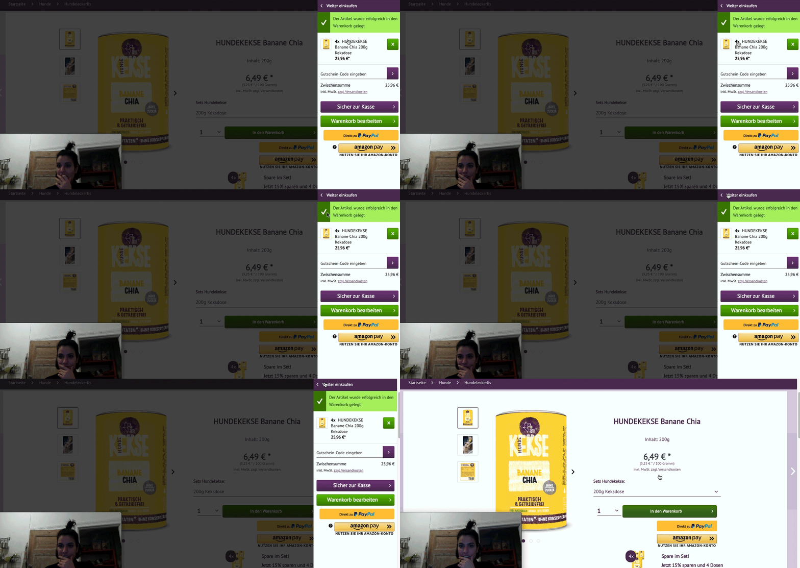
Interviews and usability testing
I´ve conducted interviews and usability testing online and offline with 5 testers, and current, and potential customers.
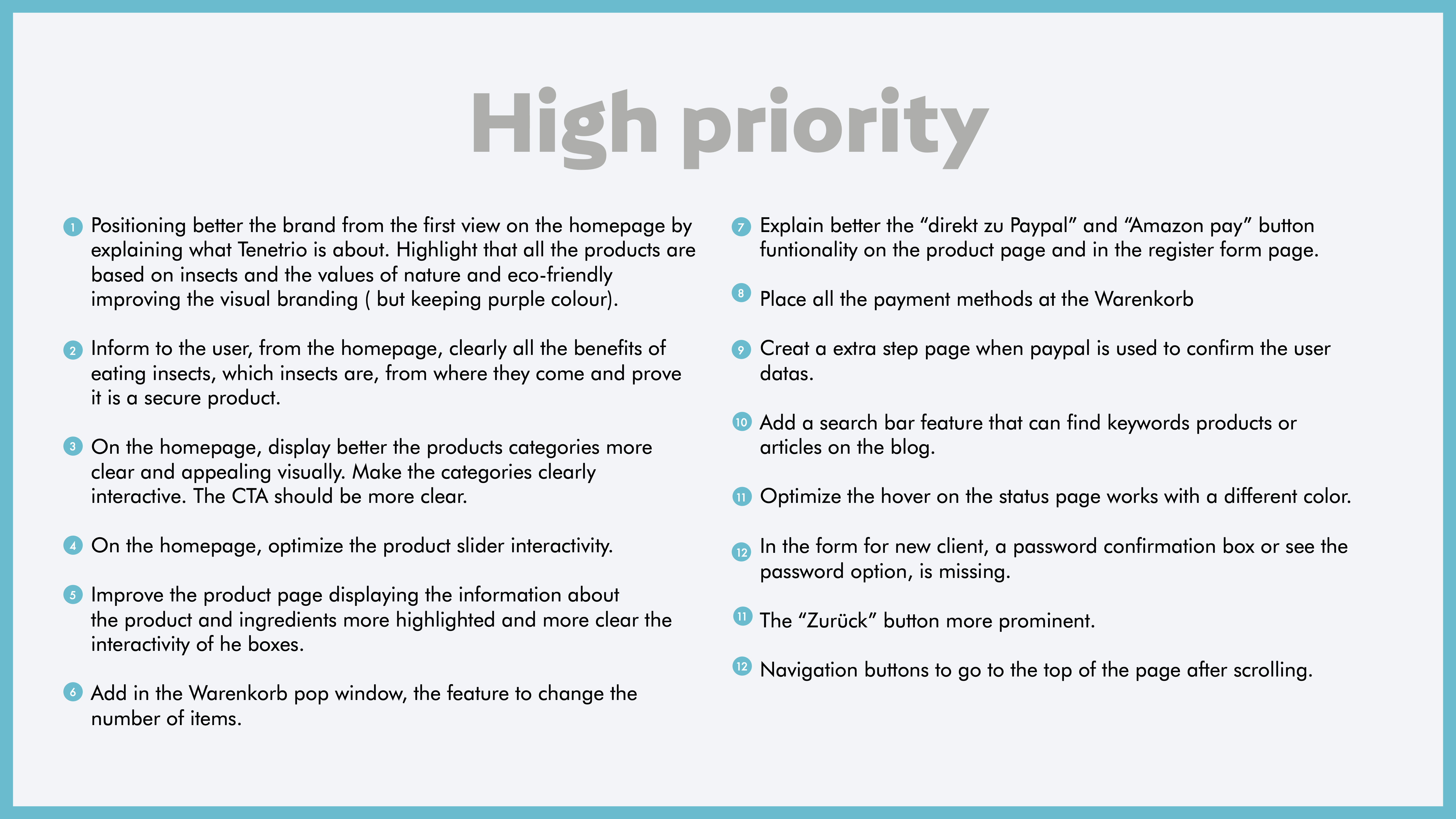
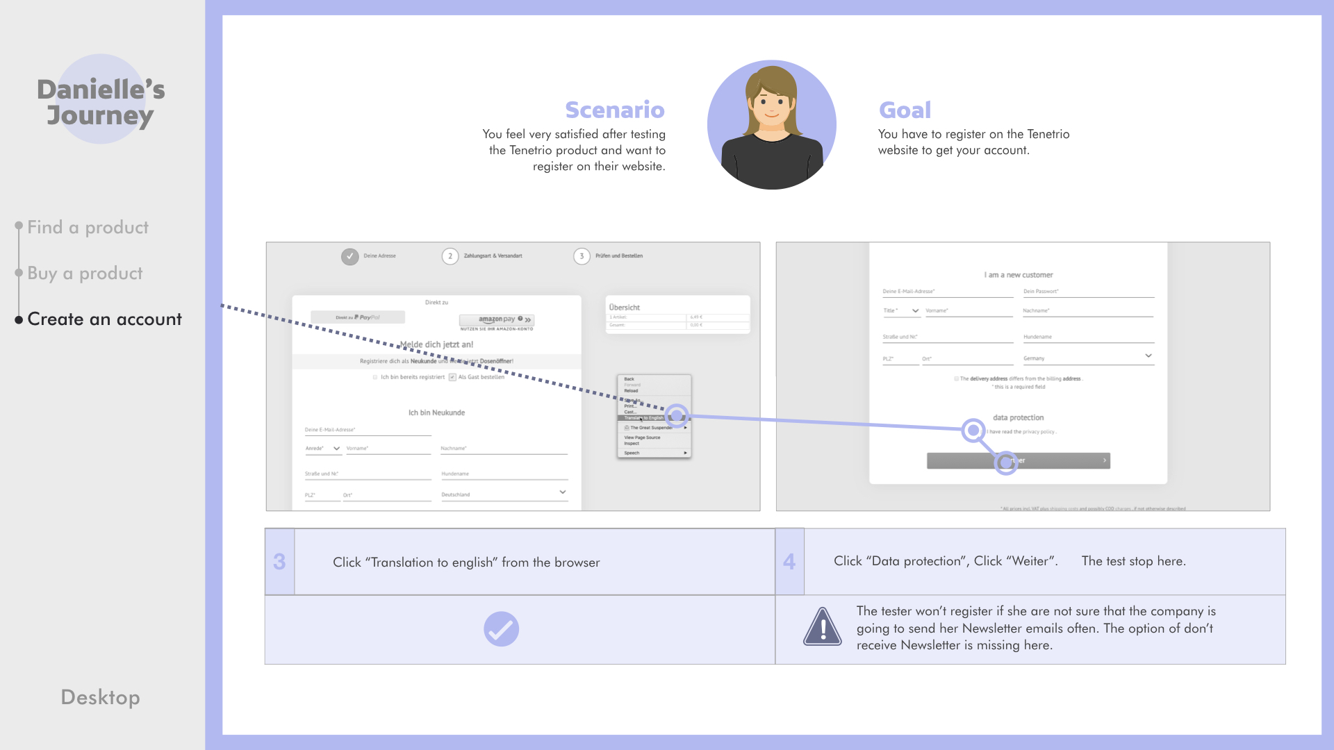
The results showed that the majority had confusion in the purchase process regarding the handling of the shopping cart, registration interface, problems recognizing payment methods and there were no specific shopping pages with all products displayed. I design the solutions as wireframe prototypes and test them before applying the final design.

Interviews

Usability testing
Solutions for a better product experience
Besides, all those who were not yet Tenetrio customers shared a lack of confidence in the brand due to not having enough information to demonstrate the benefits of something as important as changes in the eating habits of their canines. With all the results, improve navigation, content, usability, and tools so that the user knows the product better.
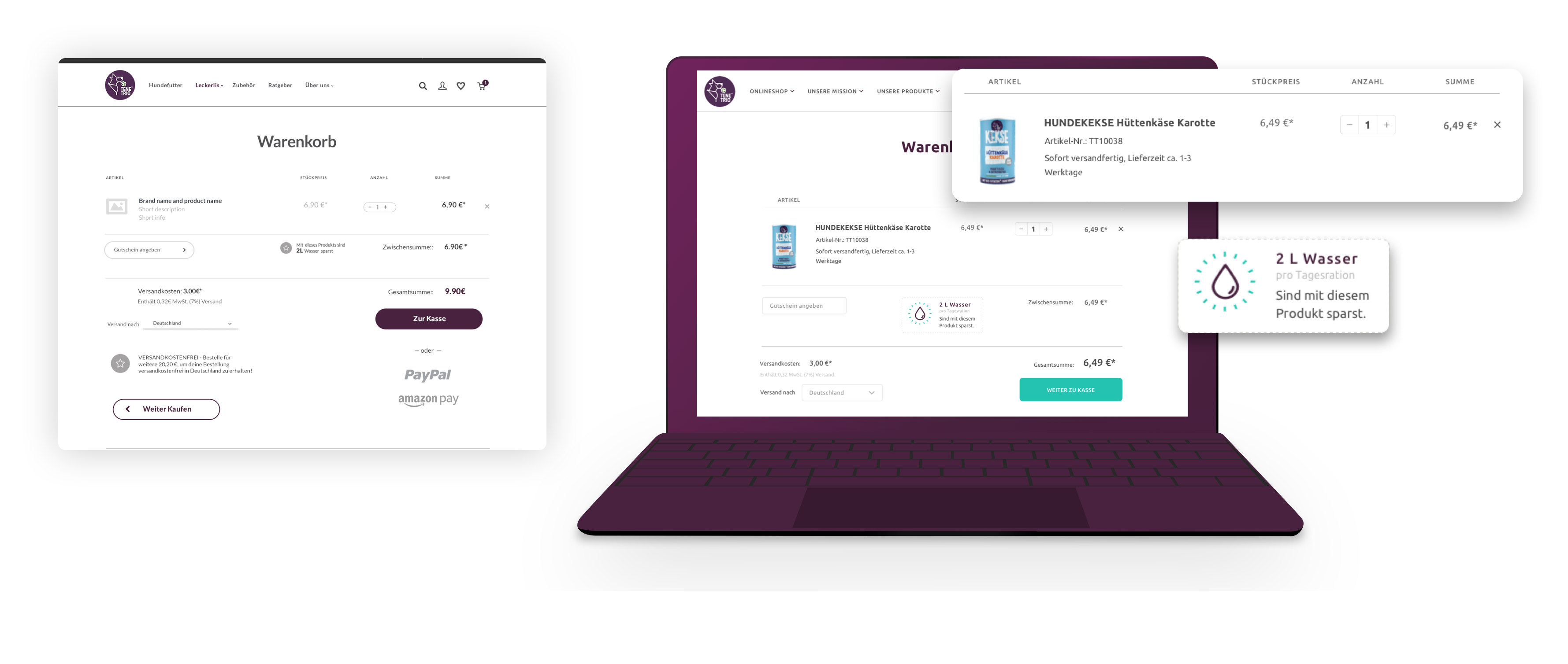
Shopping cart editing and water saving feature
After the usability testing, we see the problem that users could not modify the shopping cart with more items. This problem was solved with the item feature and in addition to including a small feature in the cart where users can see how much water they can save with their current order.
Before optimization
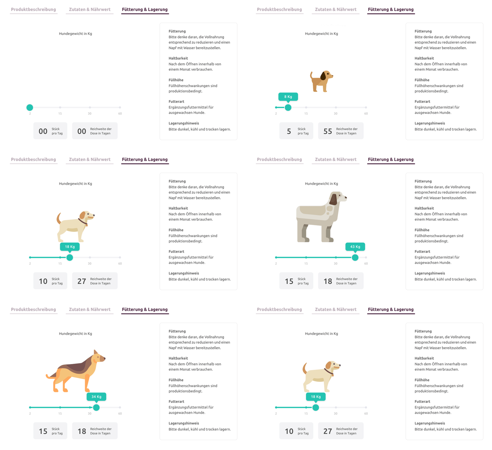
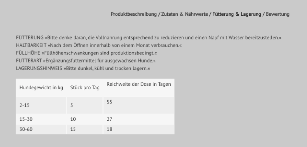
Interactive dog food measurement feature
Users have fun interactively measuring the correct amount of insect-based food for your dog depending on its weight. In the usability tests, it was possible to observe how consumers use the measurement table very often and they had a hard time finding the exact amount that their dog needed.
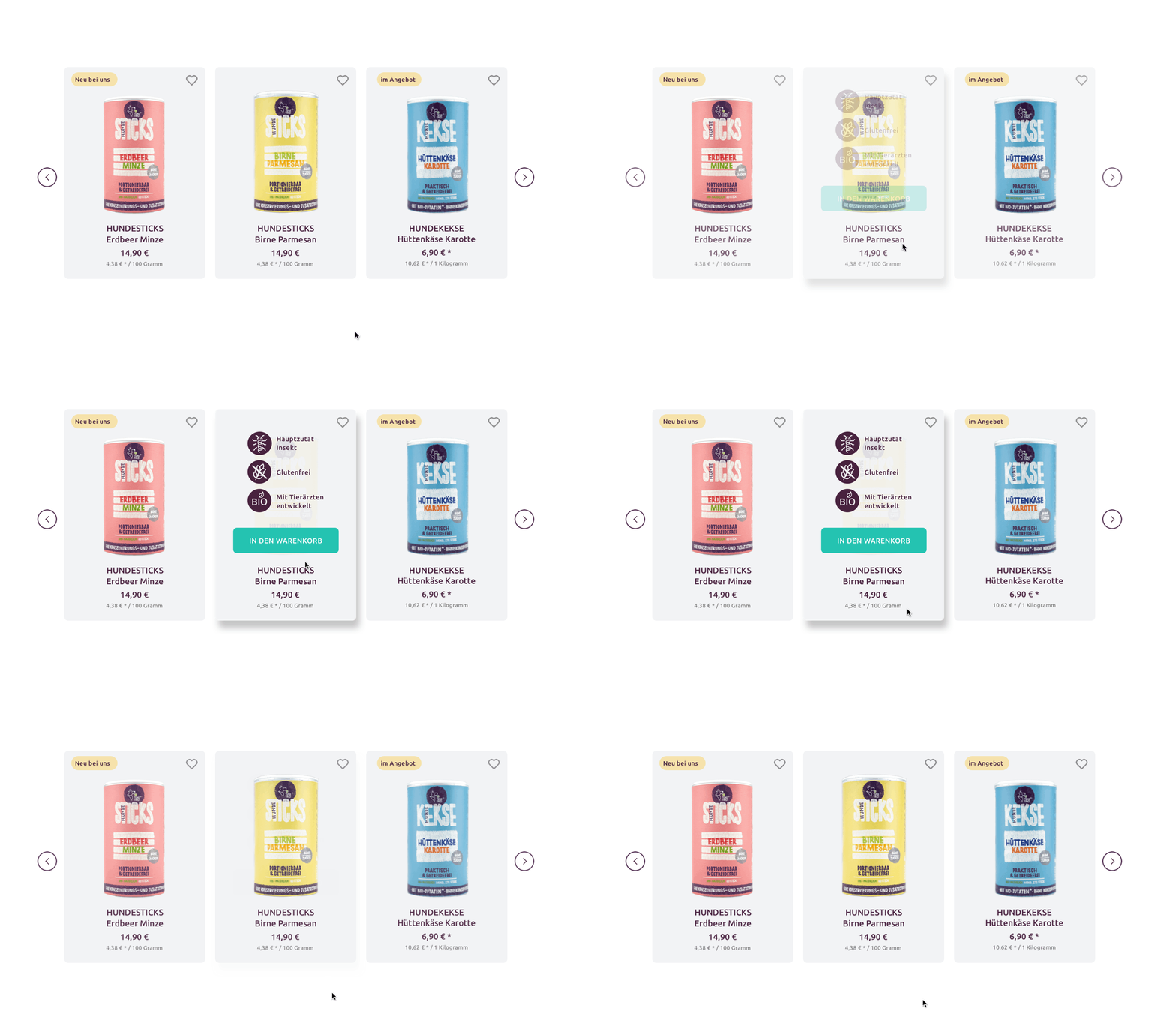
Benefits on a hover effect
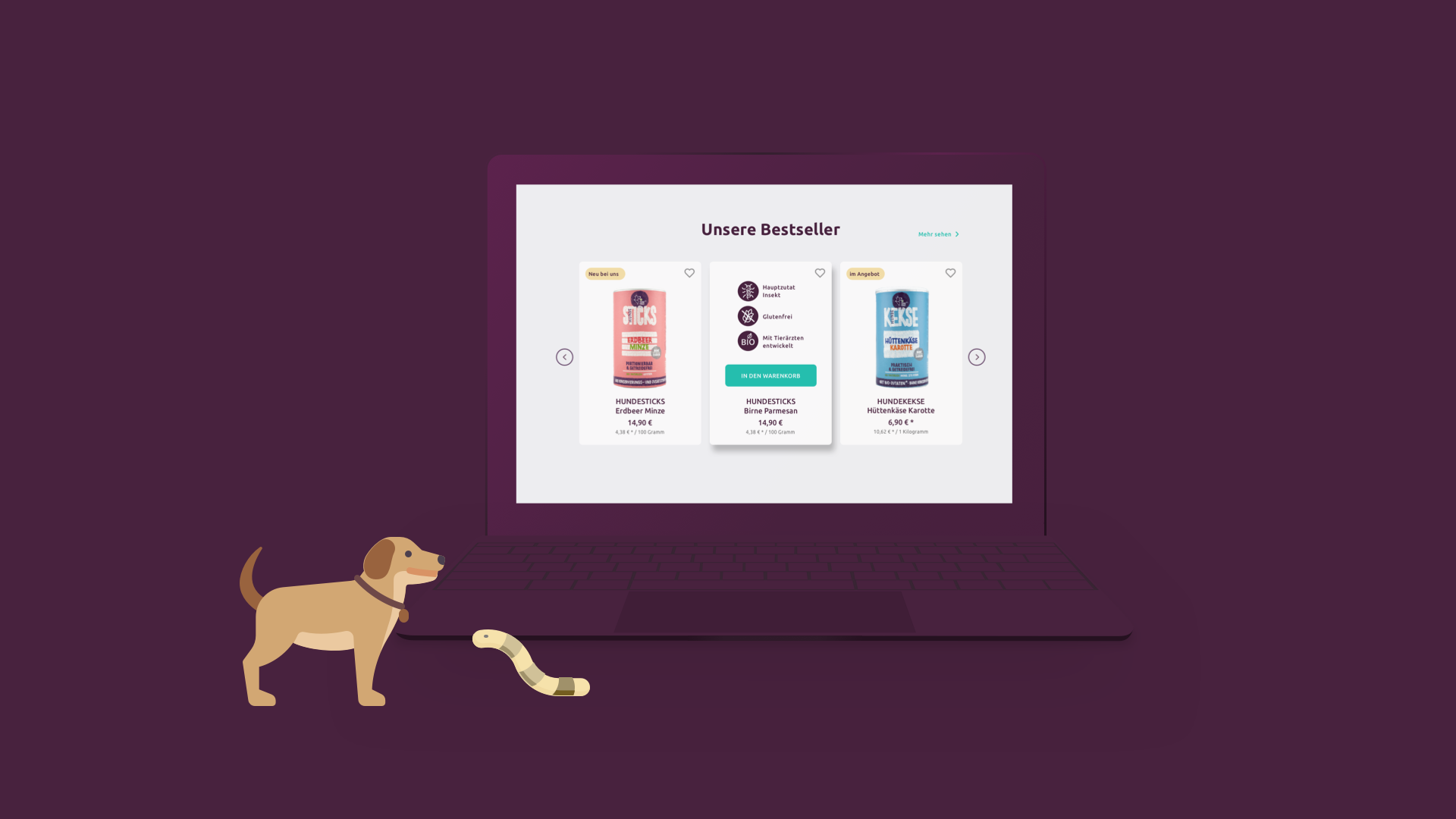
With a simple hover effect on the product, the user can see the benefits of each one, persuading him to click the purchase CTA.

Information more enjoyable
Users can know more about the product benefits thanks to features like this one. The environmental impact of each product is interactively displayed.
Blog page with visual categories and an efficient search tool
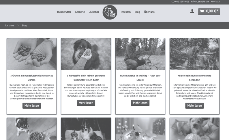
Blog page before optimization
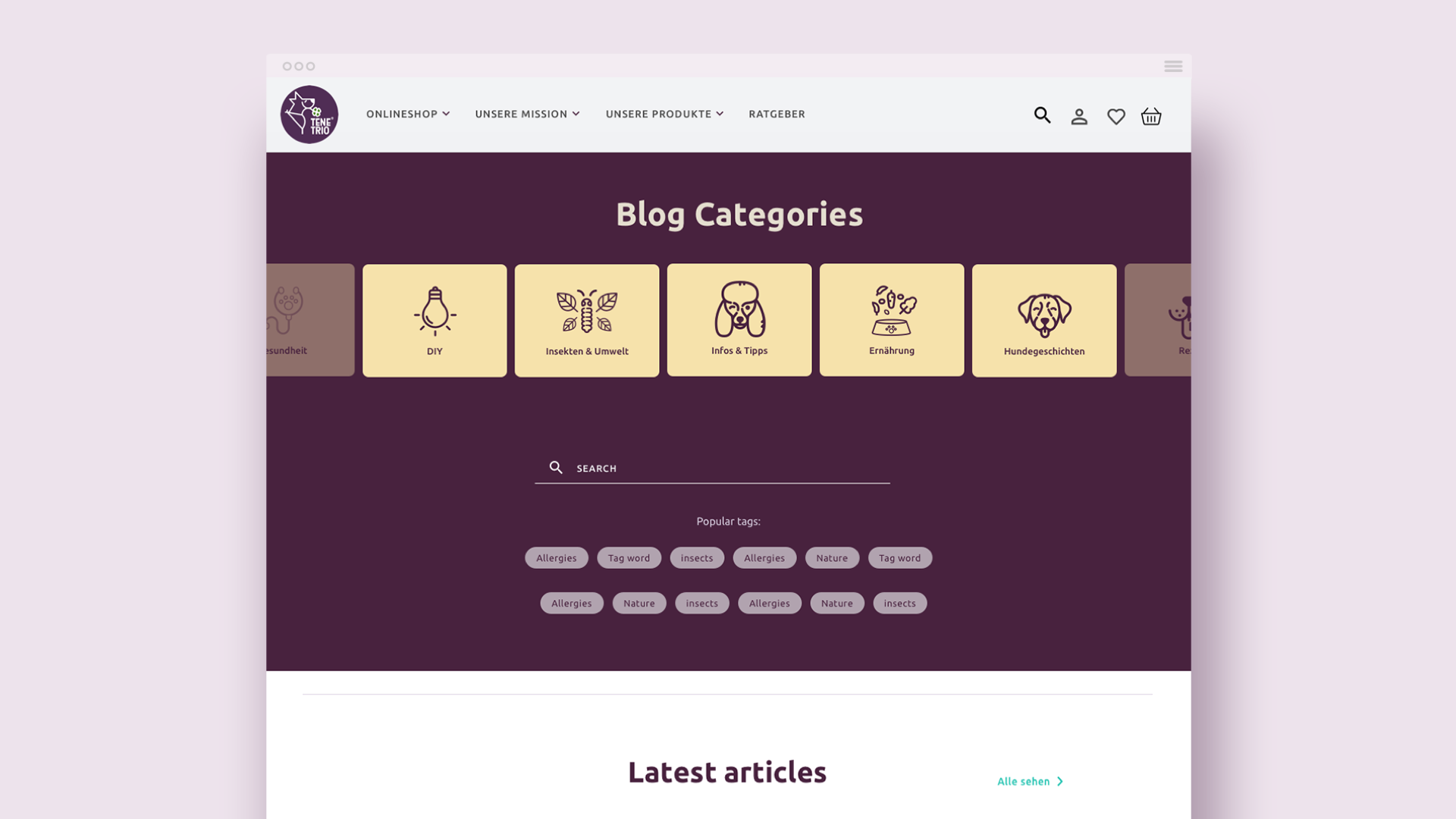
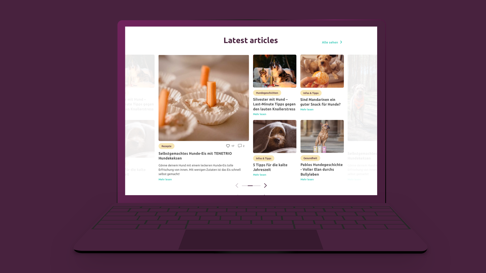
Tenetrio´s blog page is a strong tool for the brand since its articles are very popular with users. Since the articles are associated with the online store, the interface of the page and the usability have been improved, improving the search, storage, and consultation of the articles thanks to direct access to the categories by means of intuitive visual buttons or a very efficient search since it searches for keywords in articles such as ingredients, actions, etc.
Branding
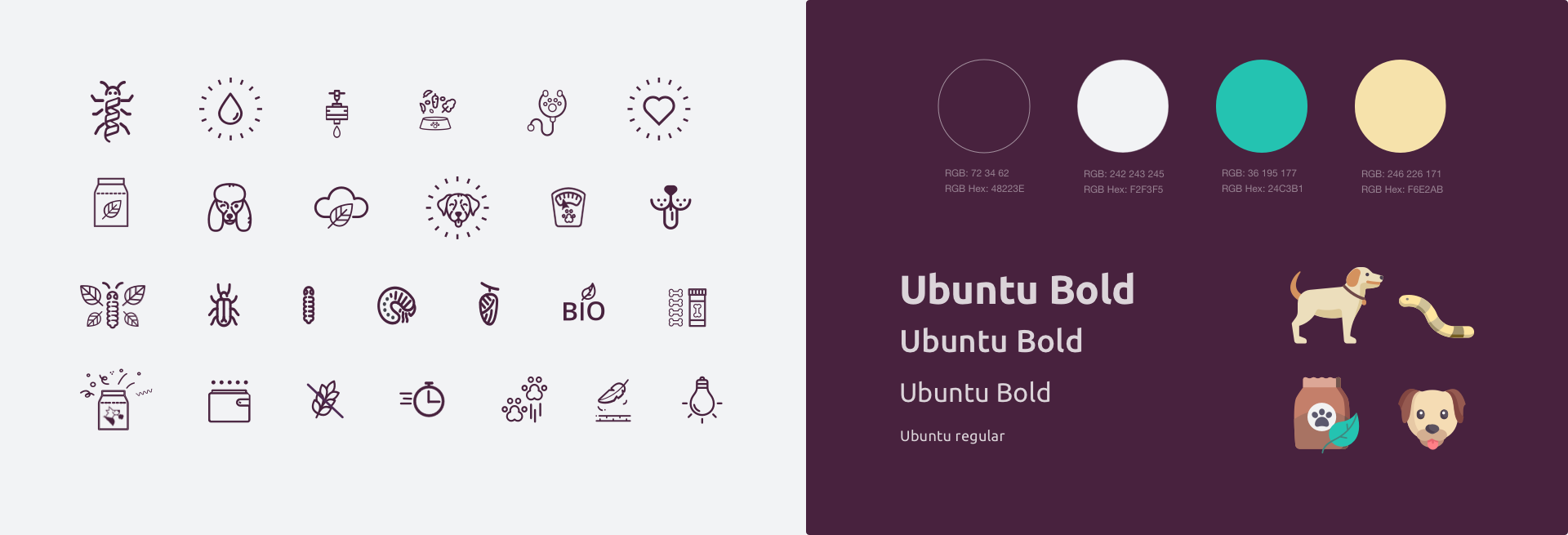
For Tenetrio’s visual identity, I have designed friendly icons but at the same time traced with a minimalist line to maintain the brand’s modern and innovative character. The colors still maintain the original purple but I added a light lilac, earth color and a green color highlight the CTA.
The final product
The final result was tested and from the homepage. The new user was able to know the benefits in advance, reach all the product pages and had no problems in the purchase process with any information on the interface.


