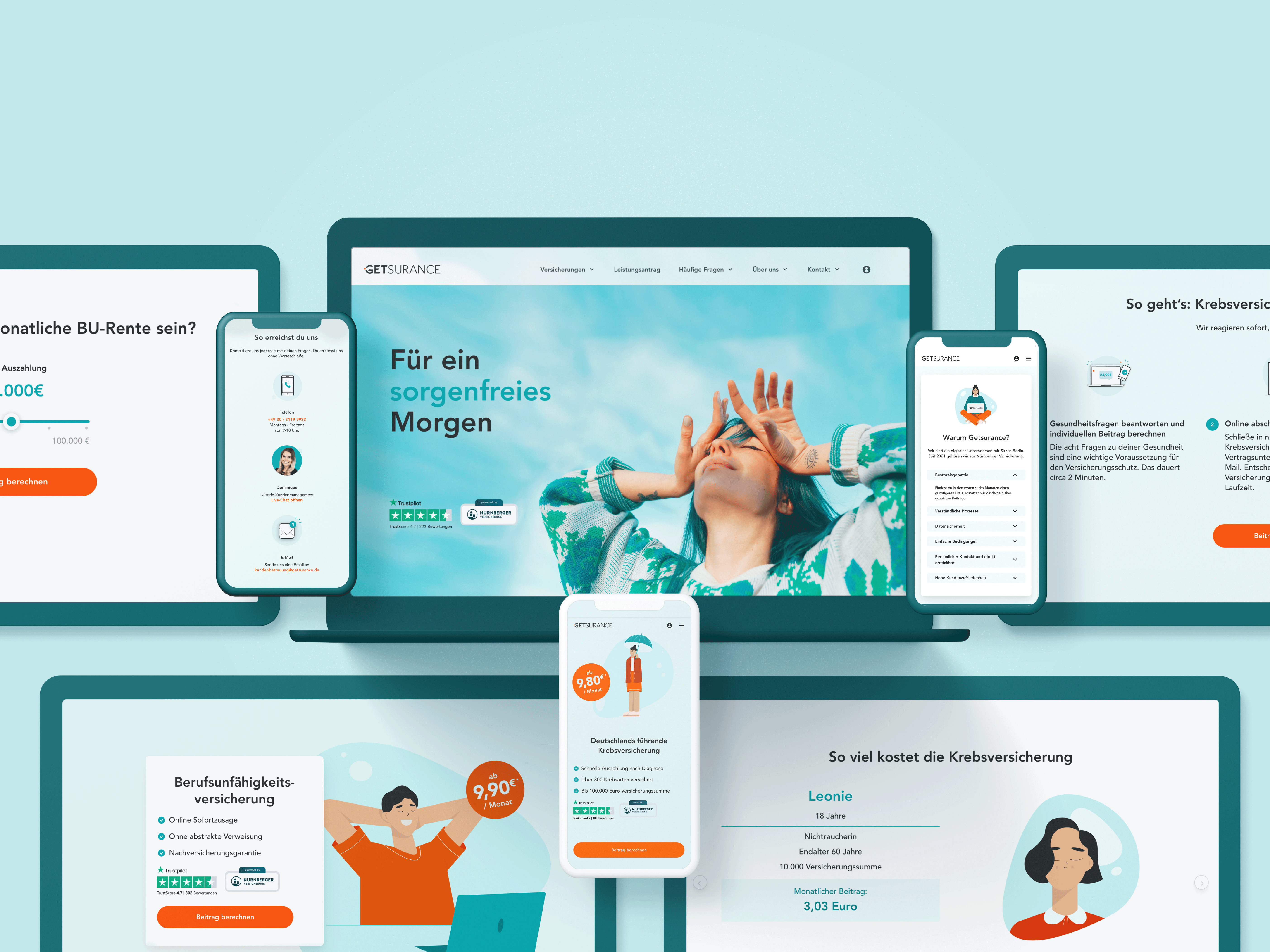

Redesign of the Getsurance responsive online platform
Getsurance offers digital life insurance that people can buy online. They are a Berlin-based company that is reshaping the insurance industry. They develop products using cutting-edge technology to create a user-centric experience. Getsurance was founded in 2016 and has been moving fast ever since with the support of our partner and risk carrier, the Reinsurance Group of America.
They want to redesign their responsive platform, so they not only refresh the branding but also apply it to the design of all the pages for Mobile, Tablet, and Desktop. They wanted to go for a design more friendly, and more emotional approach and they also wanted to create a design system with defined elements that they could use further.
Lead Art Direction
Branding
Creative Direction
Solution
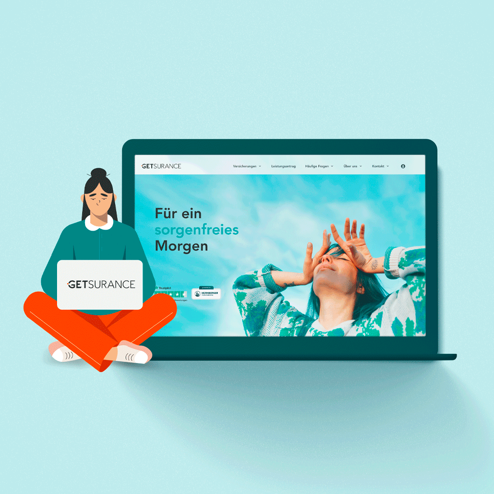
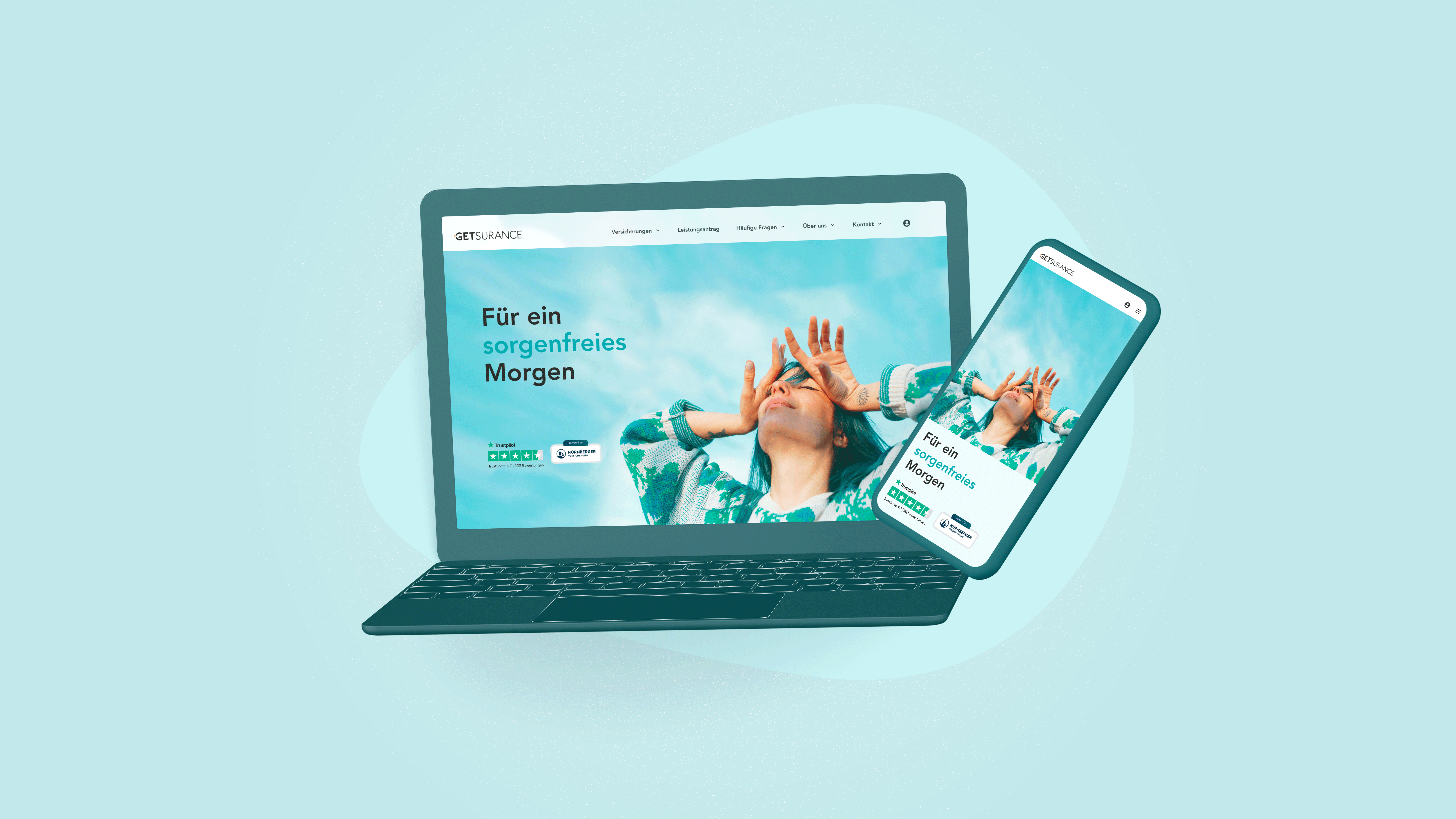
A new, more emotional, fresh and friendly brand design.
For the redesign, it was important to minimize and better define the brand’s colors, create more organic shapes, use shadows that provide depth and softness to the design, icons that are clear and fun, and define imagery of Photography and Illustrations.
All new elements were designed based on a grid system and taking care of the design of modules that can optimize the development process.
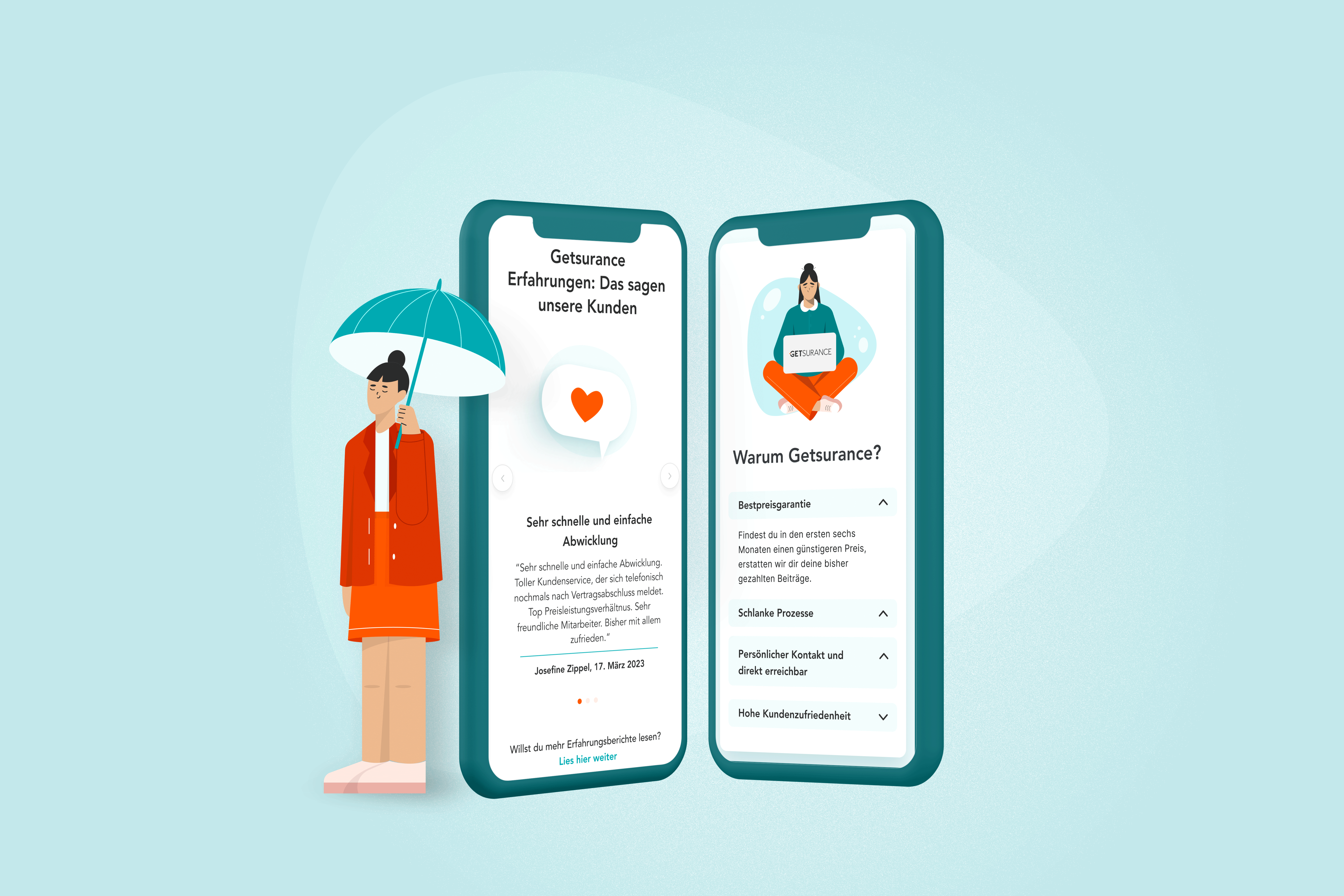
The imagery was important to communicate an emotional brand. I have defined photography using “real people” and matching the new colors with the branding. Also, Illustrations were really important to achieve the emotional and friendly values we wanted to achieve.
We have collaborated with an illustrator to deliver the illustrations we use.
The elements
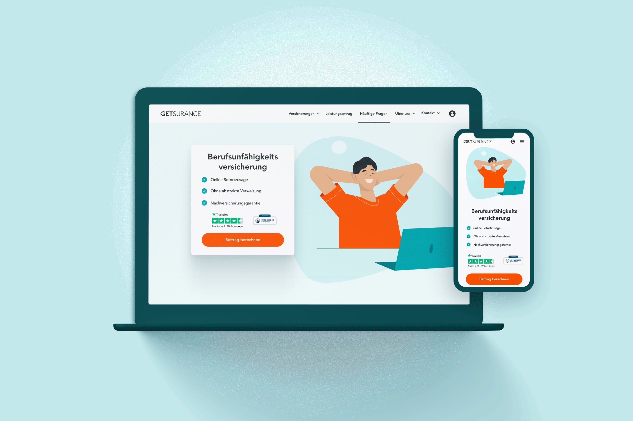
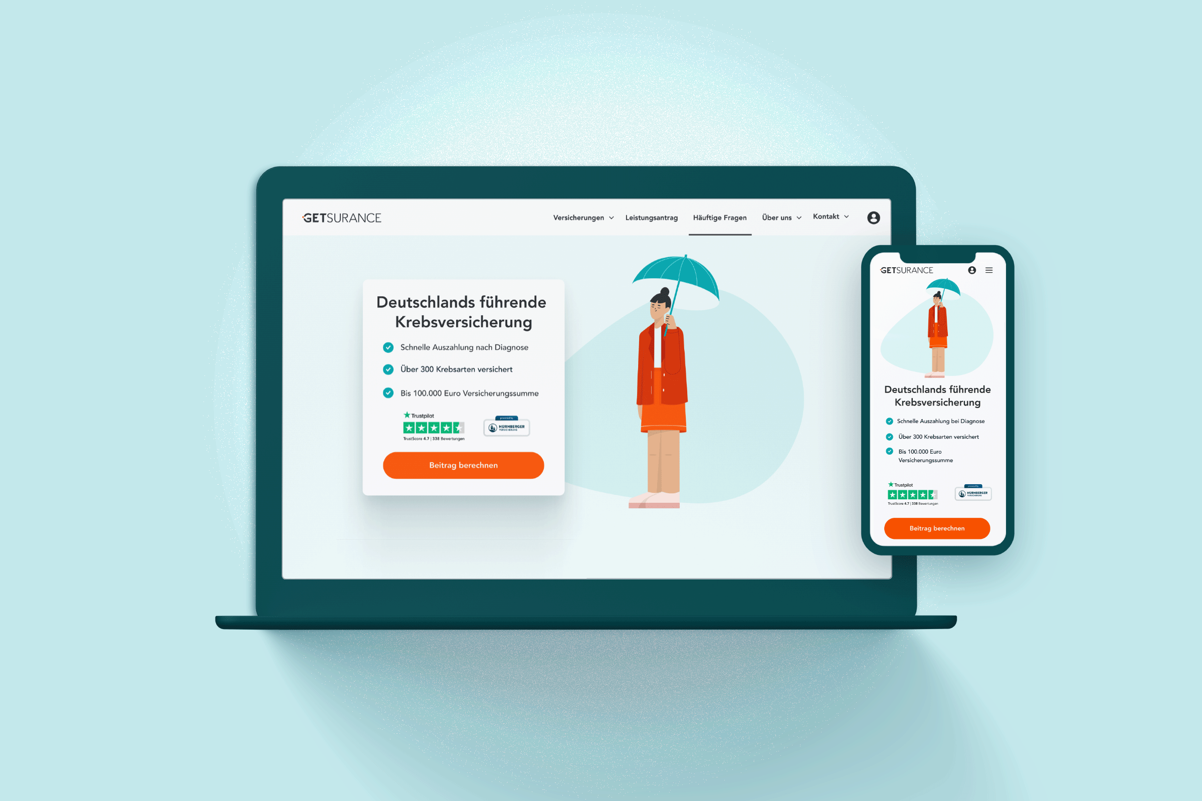
Cards
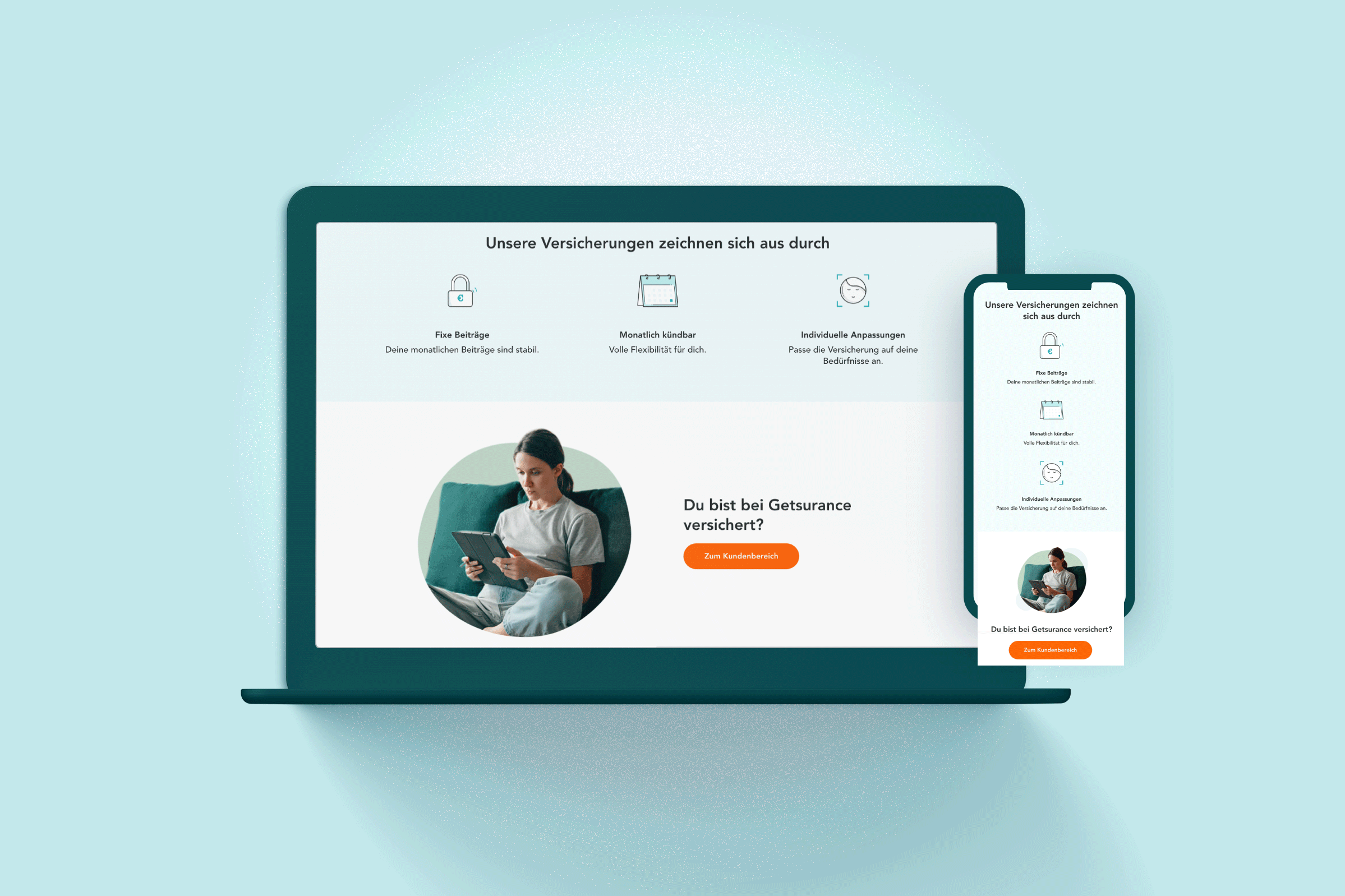
A good design for cards was important. Cards were used for many different content like prices, features or advantages of the product, FAQs, testimonials, or User cases. These cards will make the content more appealing, and interactive. Moreover playing with soft shadows will bring the layout more deepness and look more friendly. Additionally, the content of the block will be better defined, making it easier for users to focus on the content.
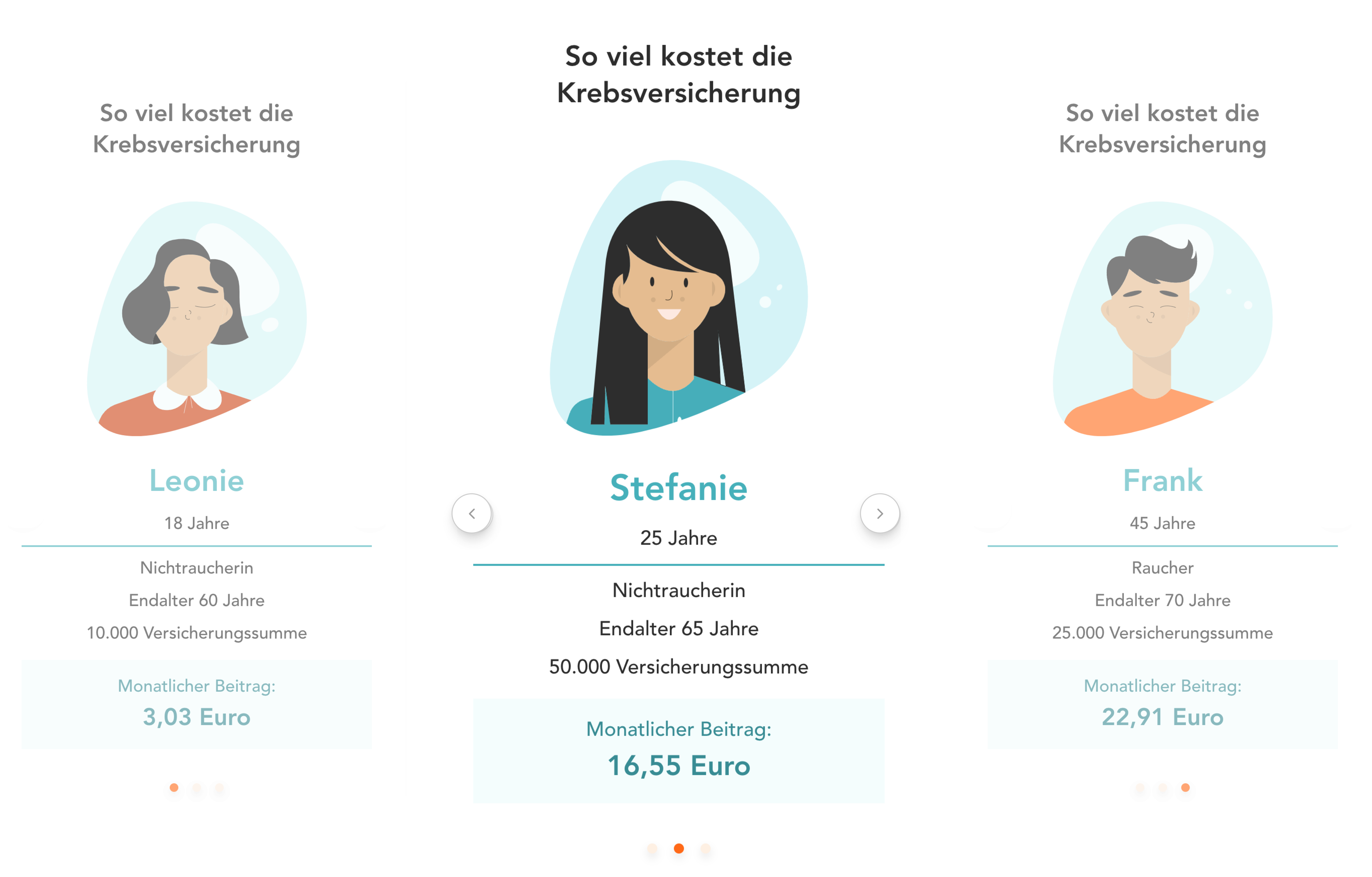
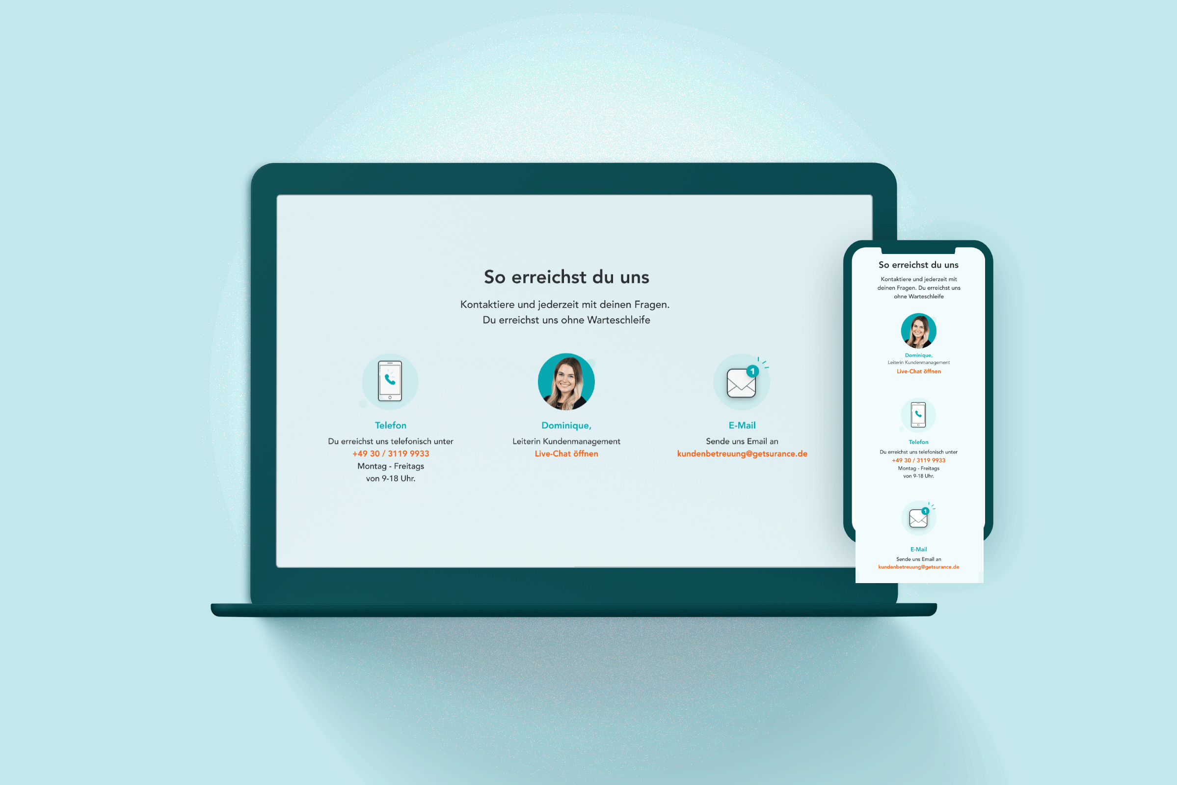
Information screens for a fully satisfactory experience
Buyers need to be informed about the insurance product they are buying. Therefore these informative screens were designed and shown in between the shopping process. Then buyers have a fully satisfied and correctly informed experience of their purchase. There are different screens for each of the different products.
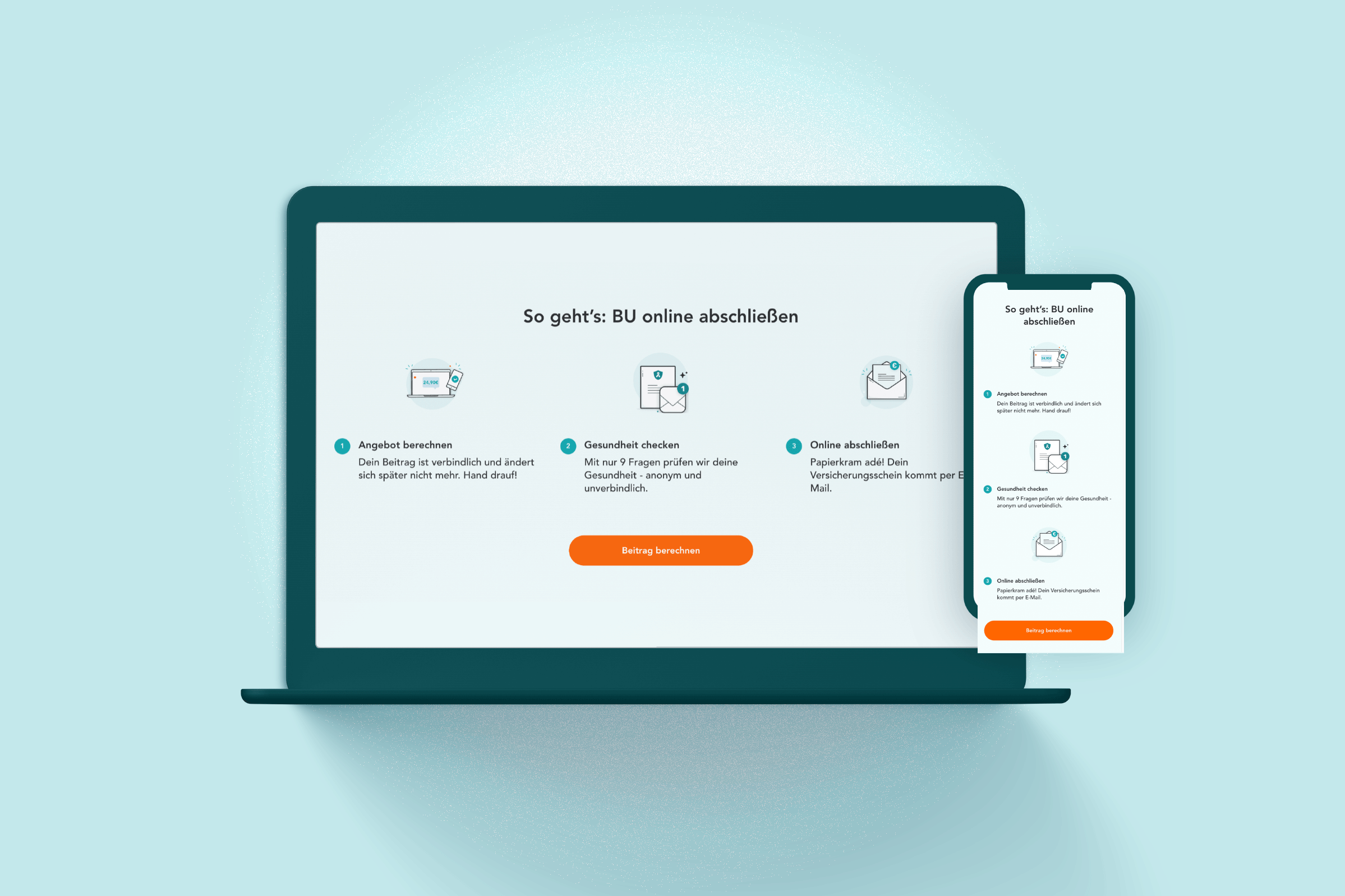
Funnel checkout
It is important that the redesign of the funnel gets good usability for users and makes a smooth online purchase process. For this, I have optimized the User Experience in 3 steps.
In the first step, the user answers some questions that appear interactively according to their previous answers. In the next step, the user is recommended a price that they can customize. In the last step, the user has an overview of their product according to their criteria. The last screen is the confirmation of the purchase (feedback screen).
It’s that easy to buy online insurance cursomized to your needs!
Design system redesign
The design system had to be redesigned with new defined colors, new font sizes (for mobile and desktop), and updated elements such as buttons, cards, inputs, etc. And styles like shadows, spacing, etc.
Also, the icons, images, and illustrations had to be updated and included in this design system as well as their sizes in their use on desktop and mobile for consistent use of them.
Design System
The final design
The final design brings a use of color more consistent, imagery and elements more emotional and friendly look. Moreover, the usability was optimized for a better experience for the buyer, like a funnel or informative screens.