
An online database platform that provides support to victims who experience violent abuse.
The Opferhilfe Berlin e.V. (victims Aid Berlin Association) proposes to create an online platform to help victims of violent conflicts. By visiting the website, victims can find the right help to solve their case without having to search for a long time and safely.
Another challenge to be achieved is to be a multicultural platform, accessible to people with disabilities and with special consideration for victims of extremist political violence. The target group must find their result fast, easy and must feel secure in their experience. Search engineering must always offer a result to the victim.
(Victims Aid Berlin Association)
Lead Art Direction
Digital Product Design
Conception
Branding
Creative Direction
User research
User-Centered Design
Information Architecture
Solution
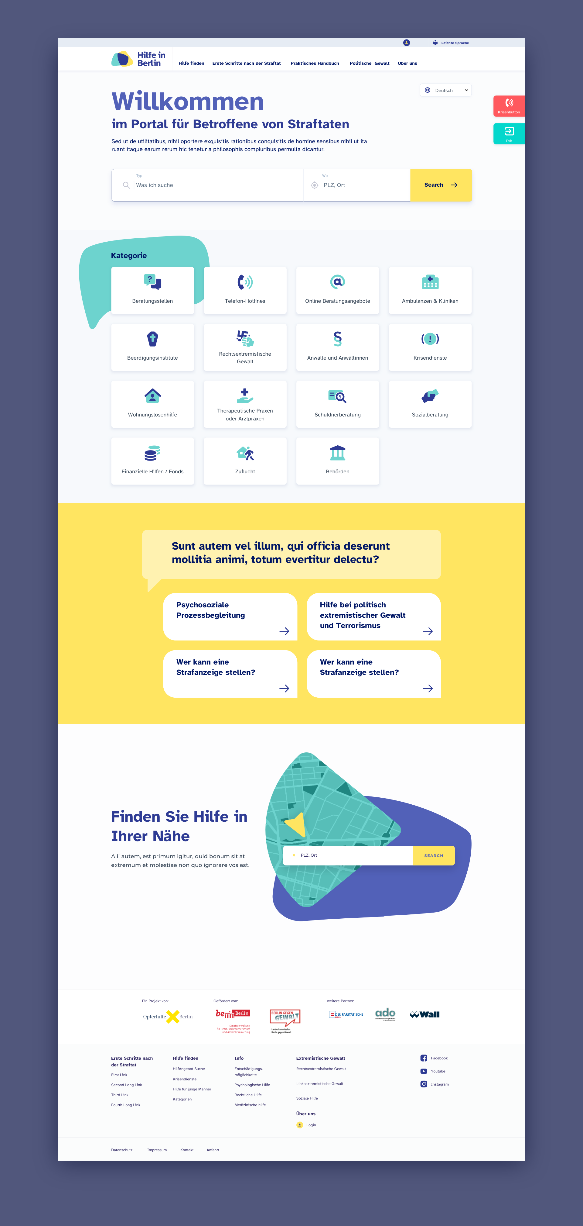
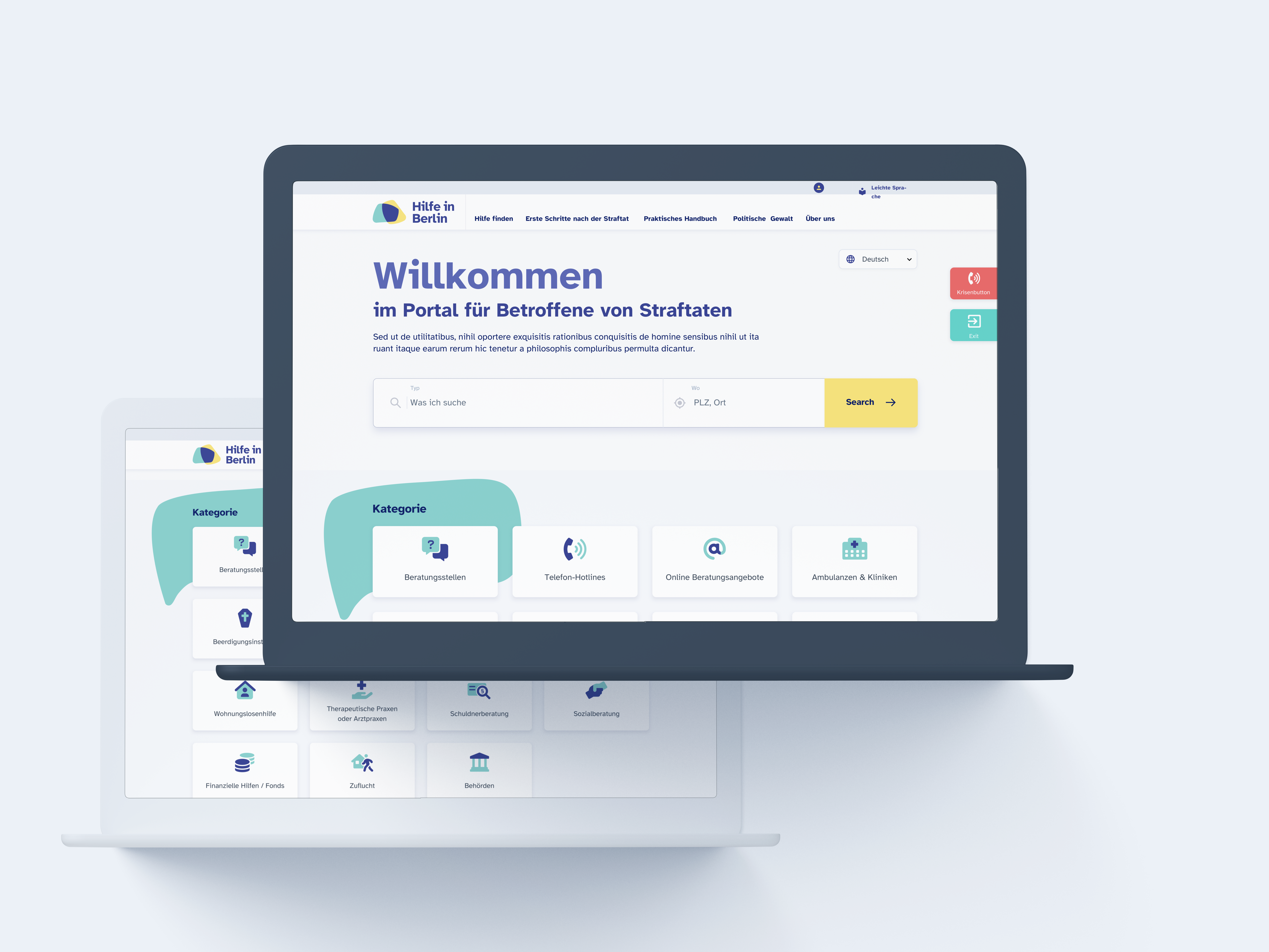
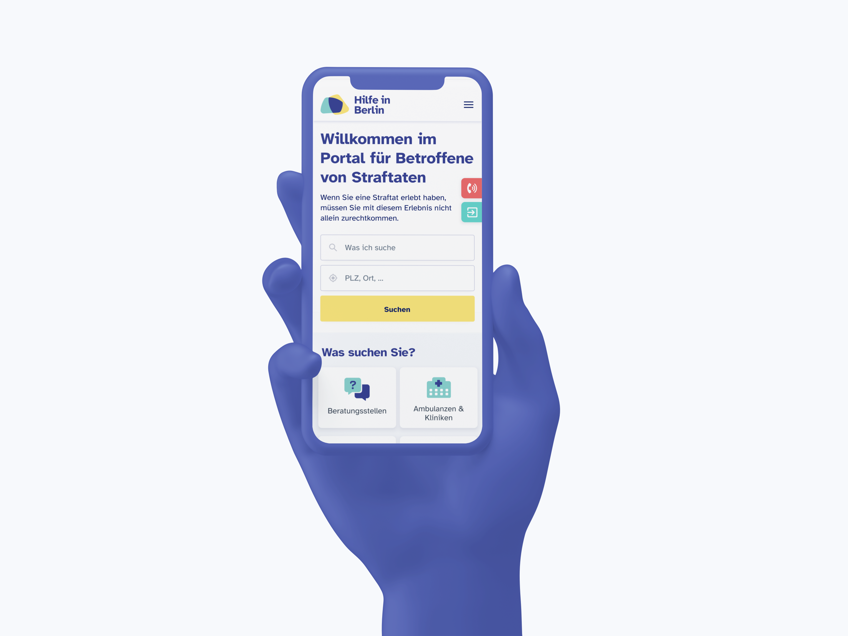
A new online portal with an intuitive, functional and Accessible Design.
The online portal used a User-Centered Design for an efficient experience to provide local resources and support facilities to victims of a violent abuse case. The design is based on Accessibility Guidelines.
User-centered design techniques were applied here like Interviews, Personas, and Customer Journeys. After the results, it was possible to build a platform that was really useful for the victims.

The process
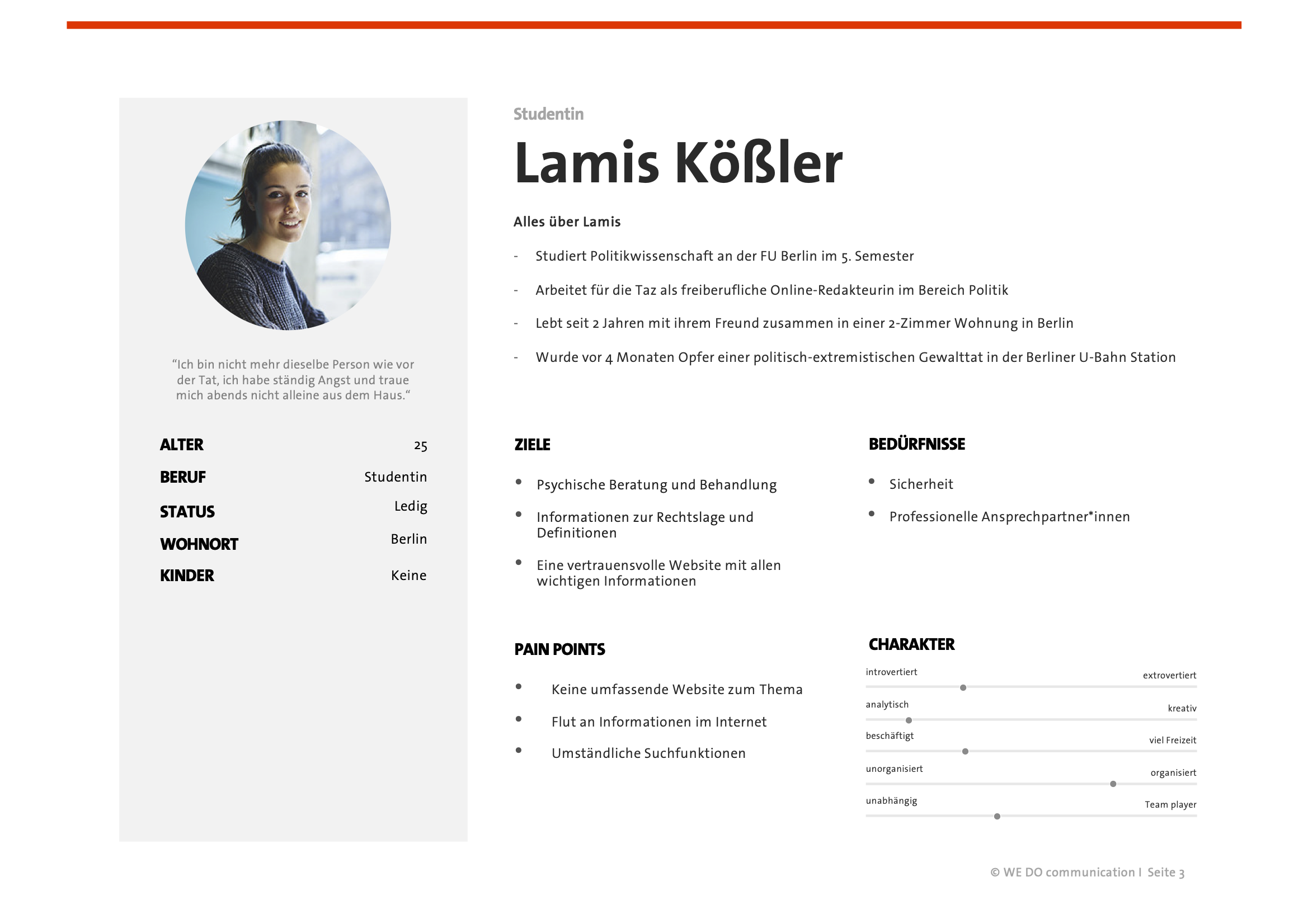
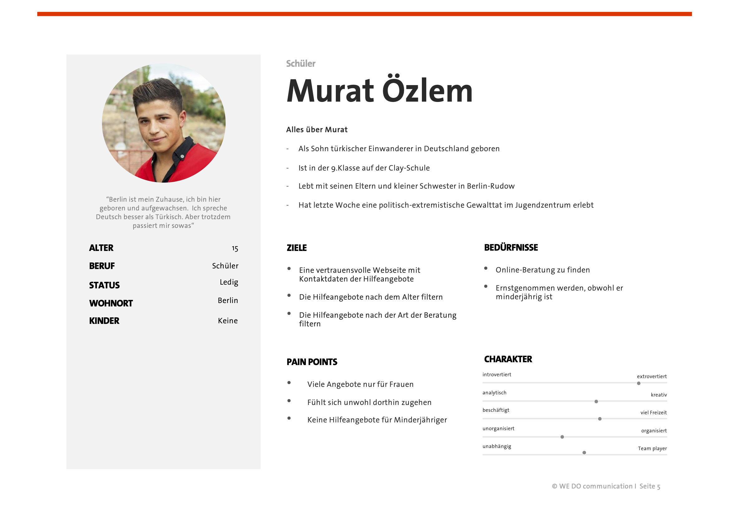
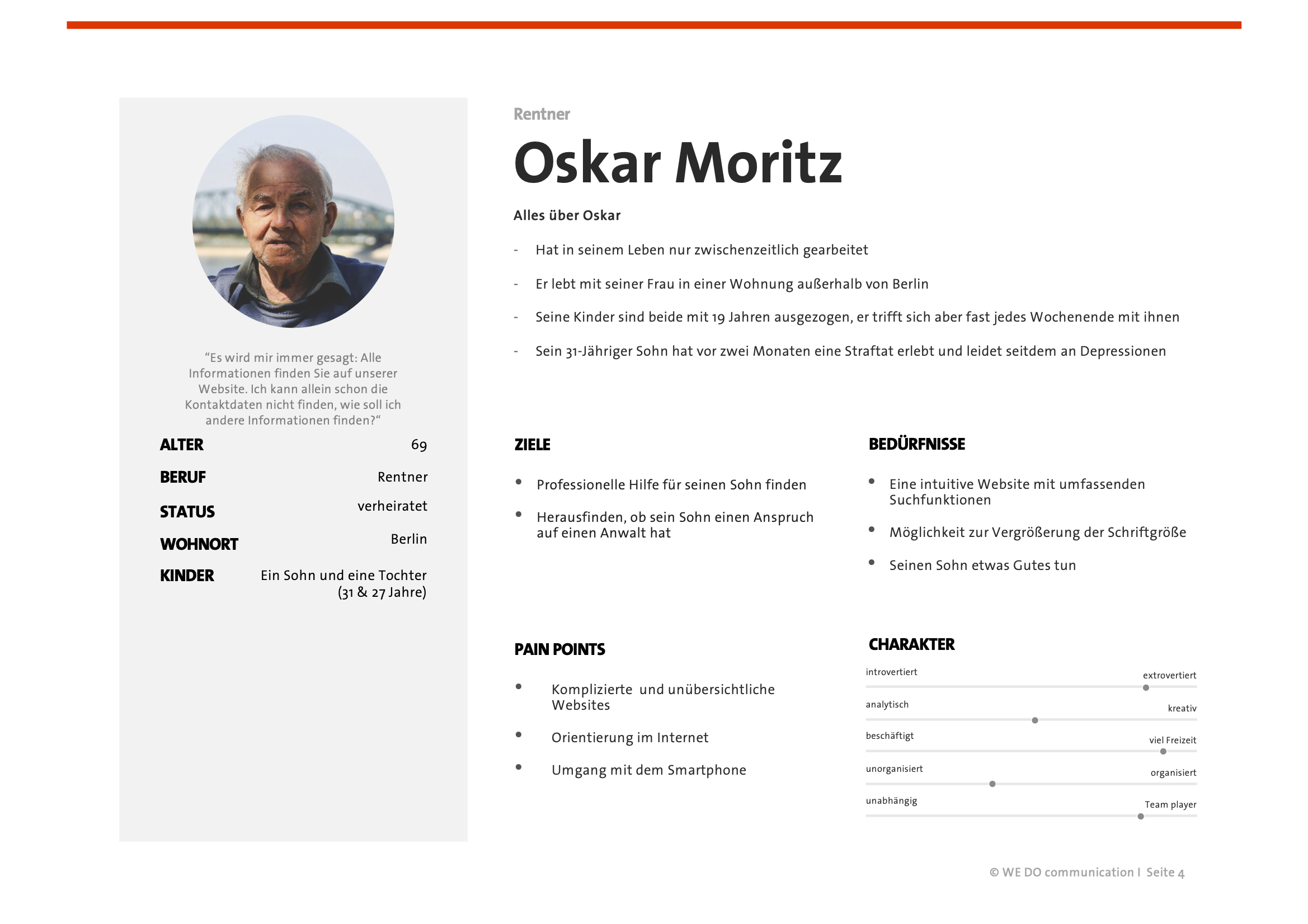
User Research
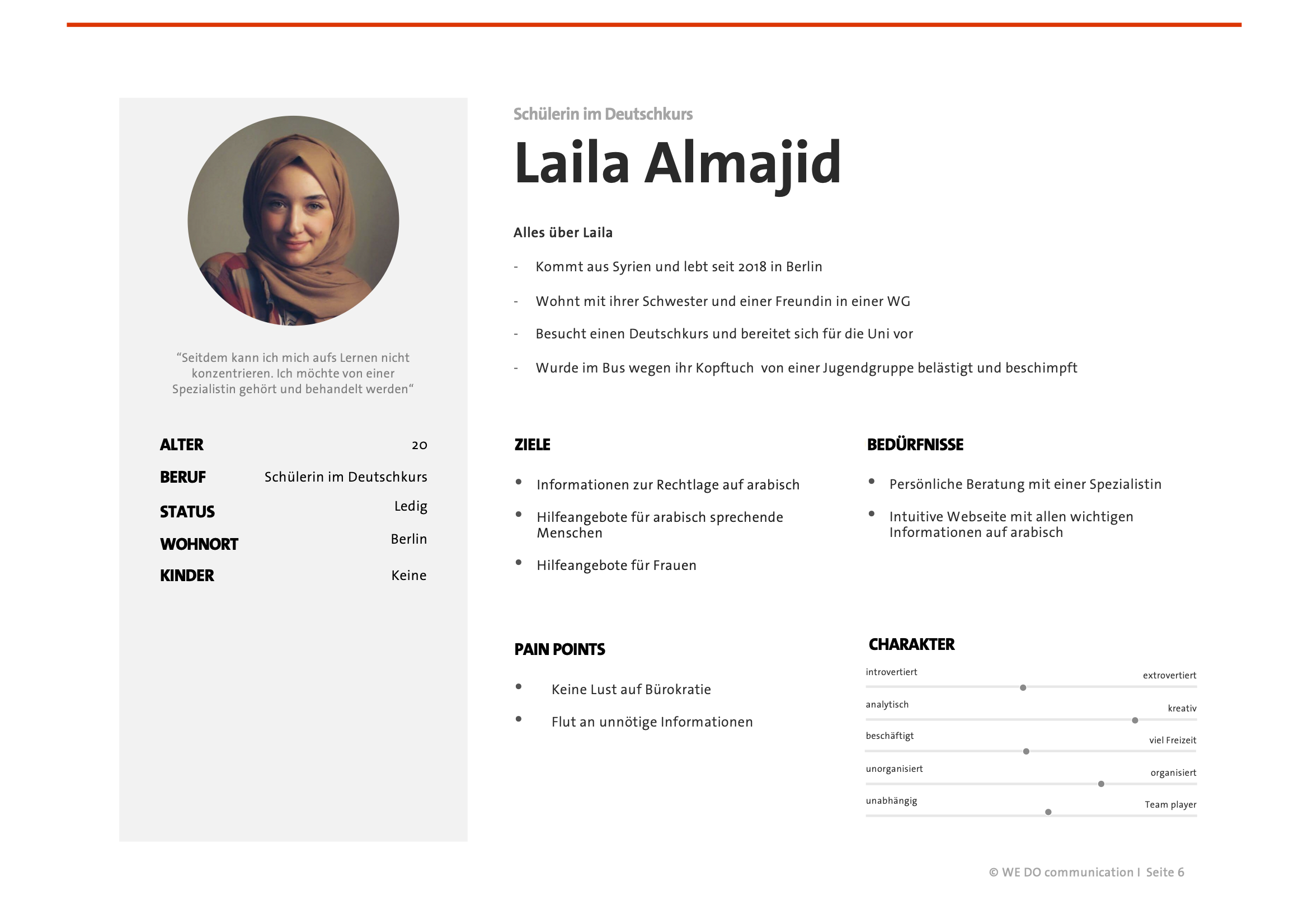
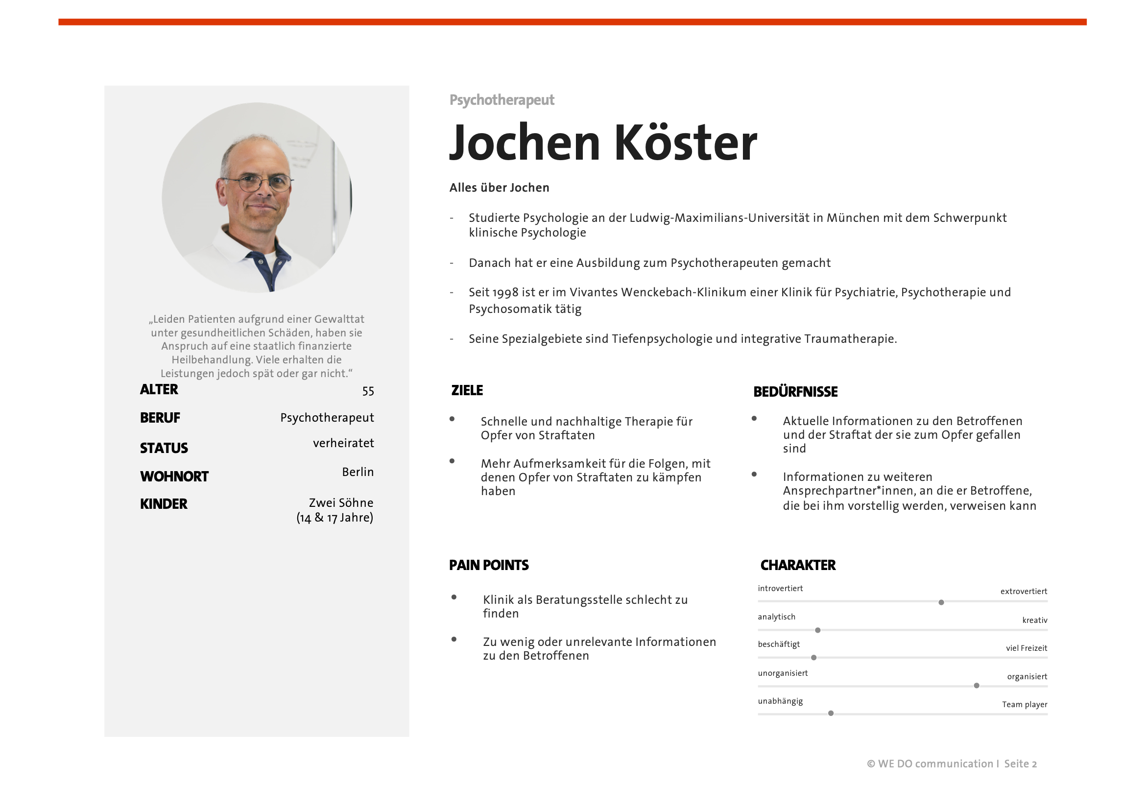
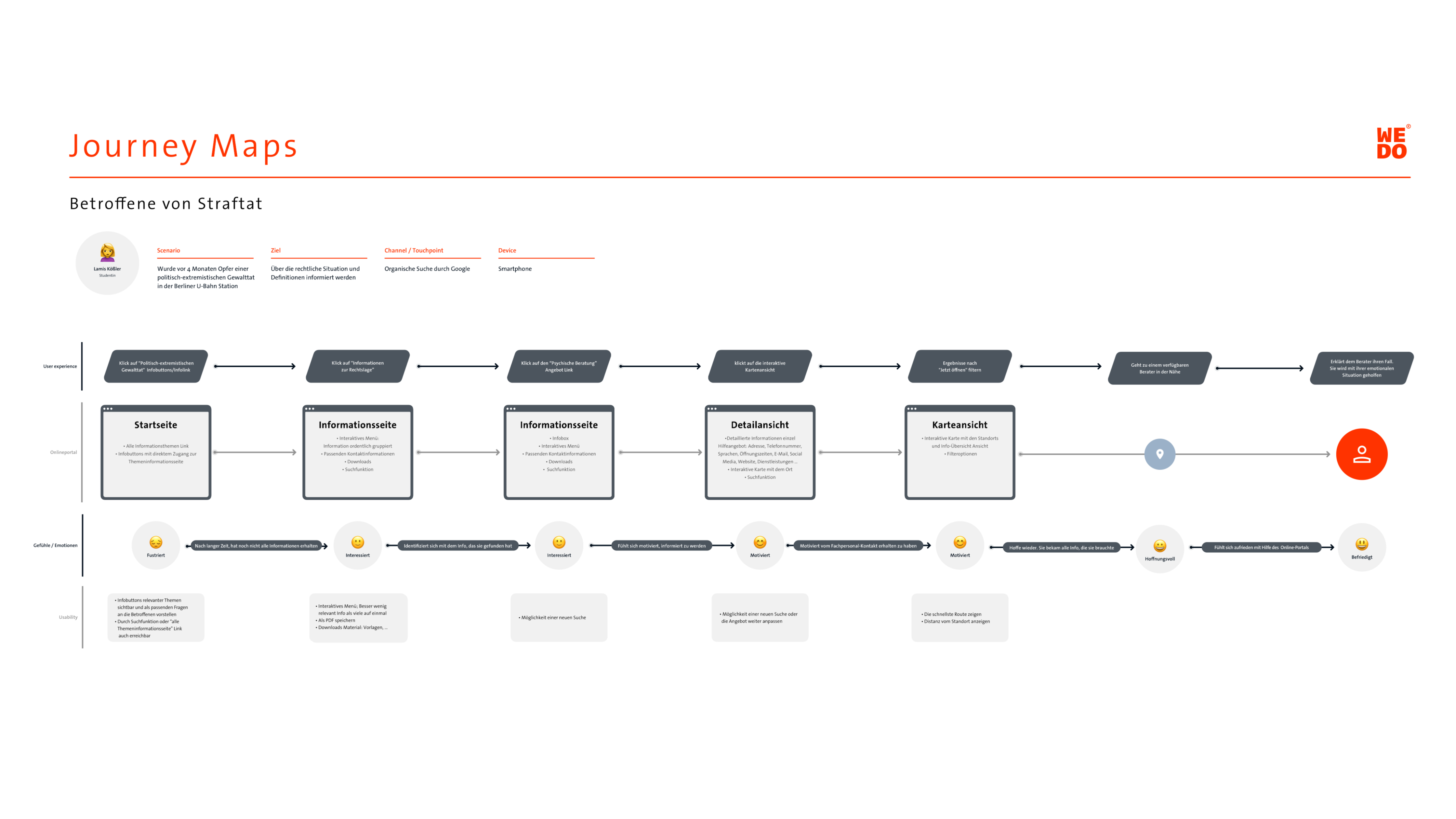
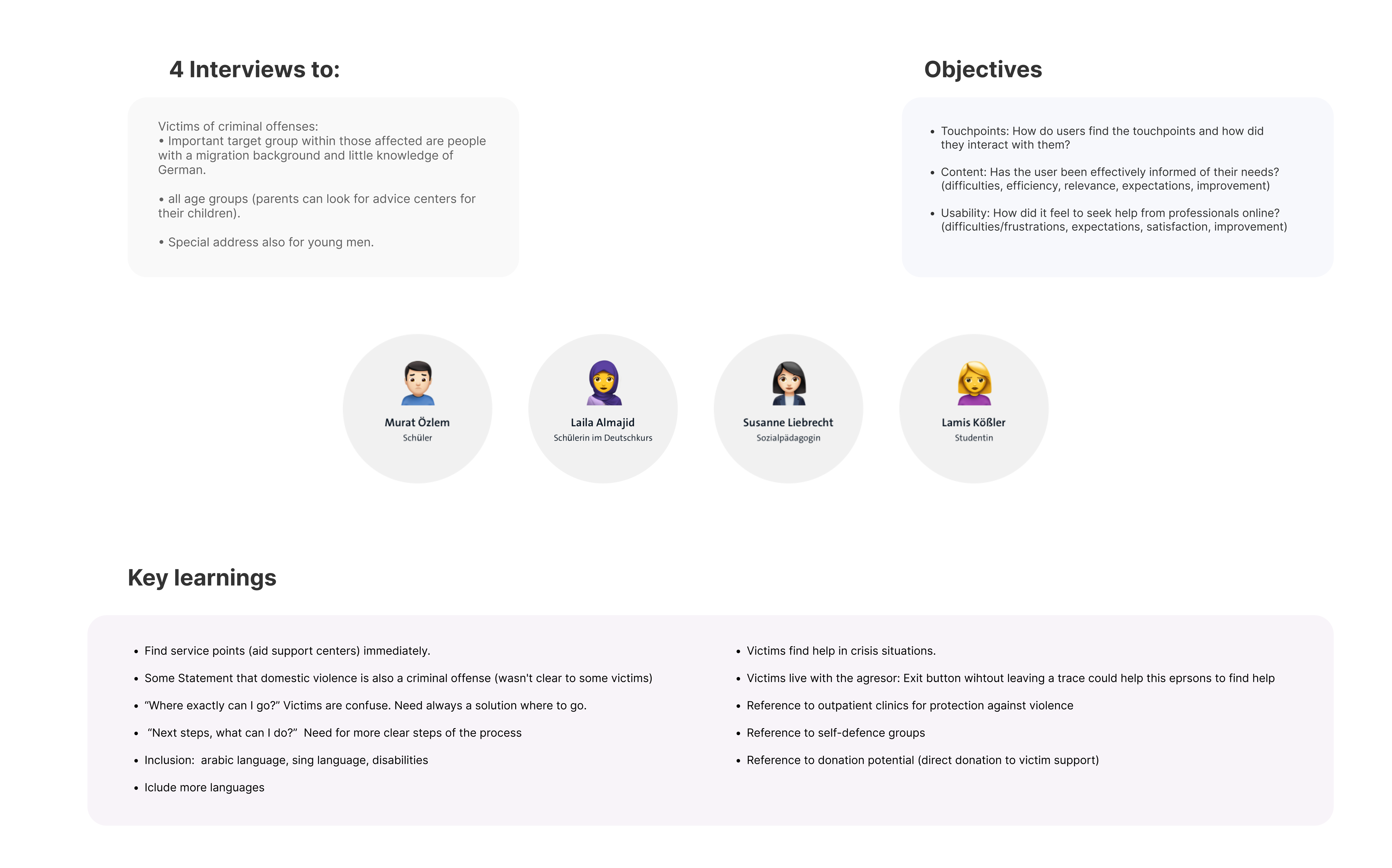
The first part of the research was created the User Personas who represent our target audience. The User research process involved interviews with workers of the association, to provide quantitative data on the victims as well as interviews with victims who have resorted to the association to provide qualitative data. Thus, the way the portal should be designed could be understood.
Personas
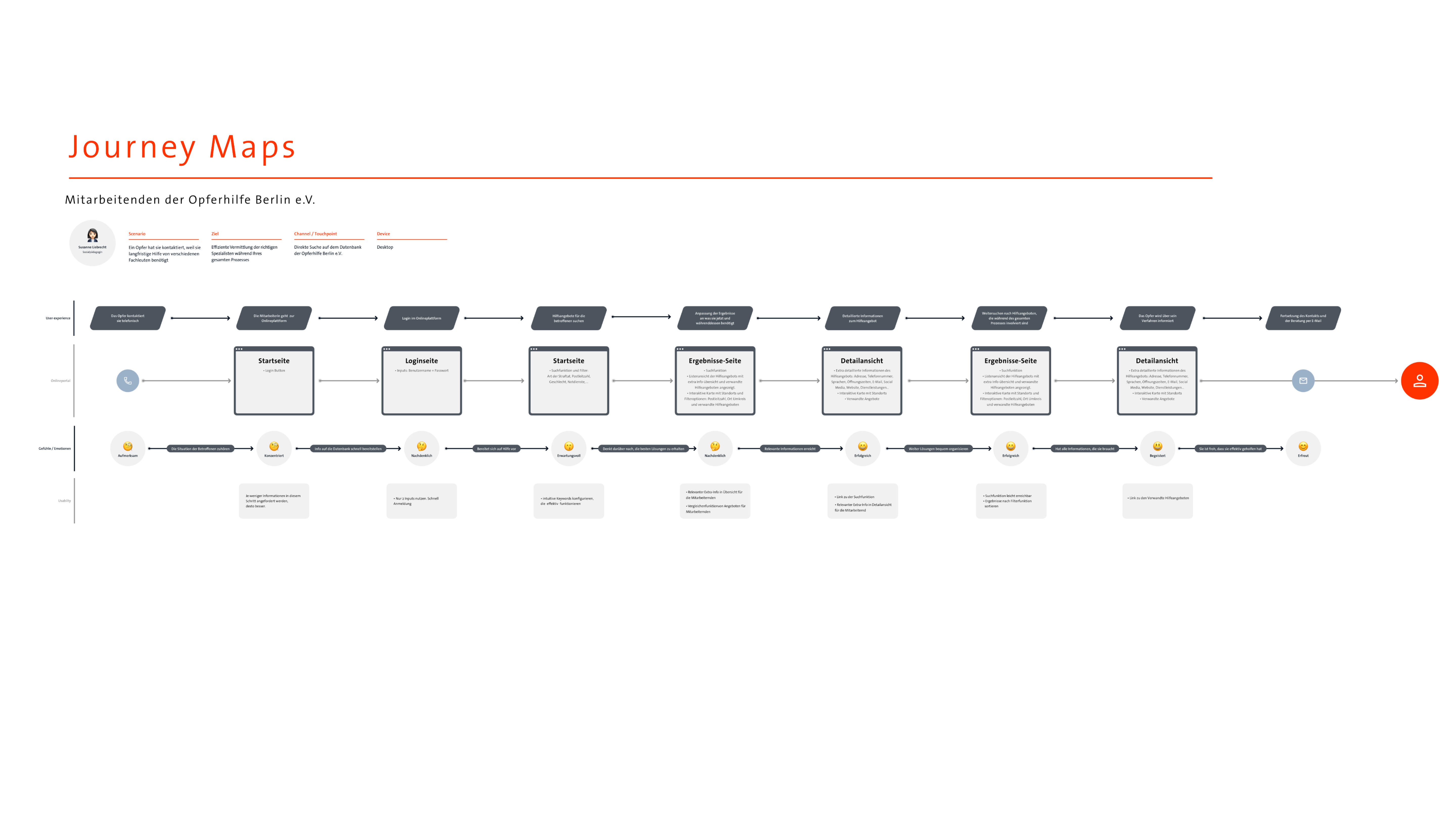
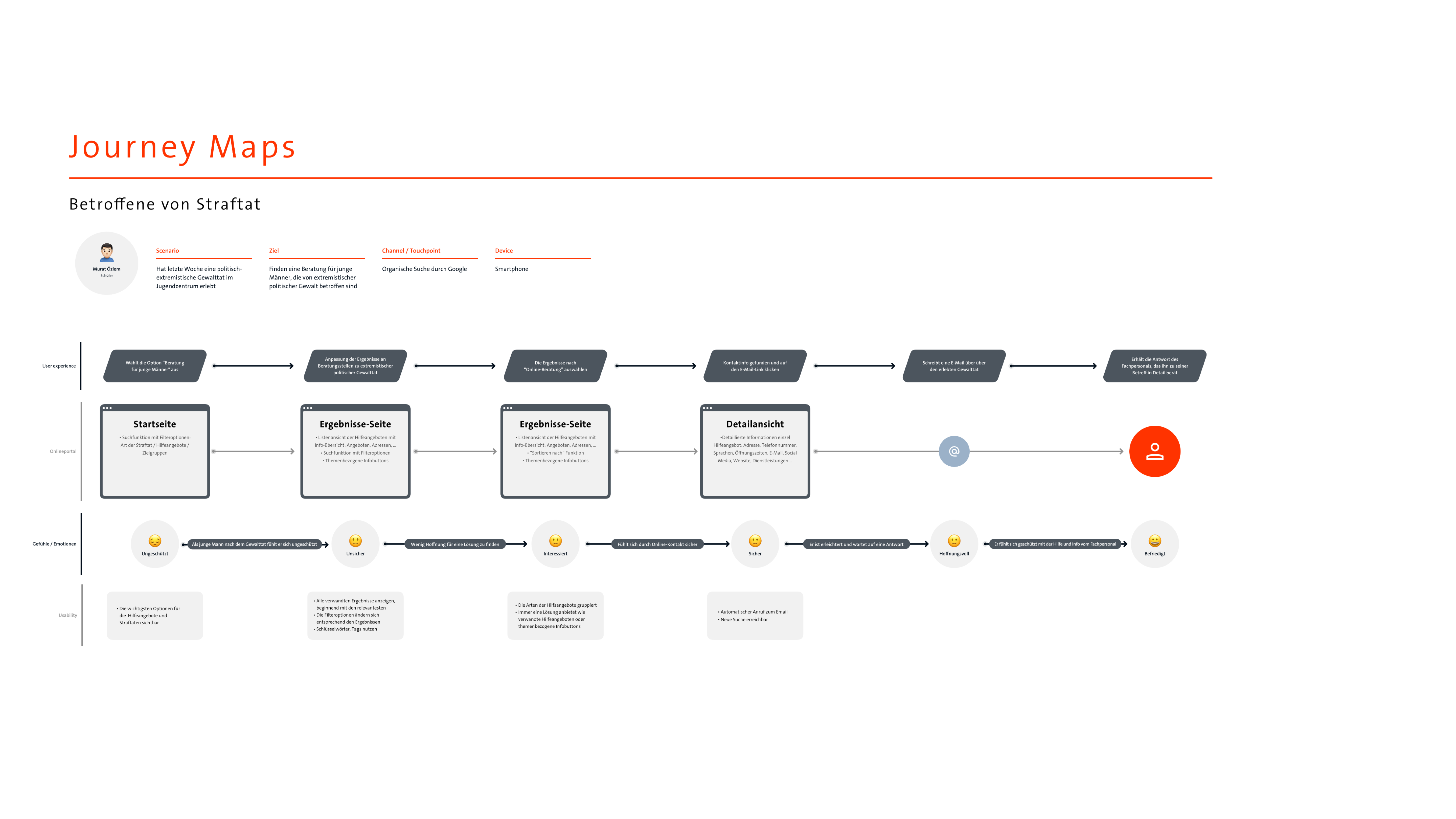
Customer Journey Map
User Interviews
5 interviews were conducted with victims who used the aid support service in berlin and a worker there. The result highlighted the importance of inclusion (languages, contrast, ..), of showing the information content very intuitive, the search for very intuitive and localized help, and the existence of help in situations where crisis is always available and to exit from the page due to the presence of aggressors.
Wireframes and Concept
All the inputs were applied to the functionality of the portal to achieve the most optimal functionality possible for the user. It was designed what content to display and how to do it. For this, based on the sitemap, both wireframes and prototypes were created.
Wireframes
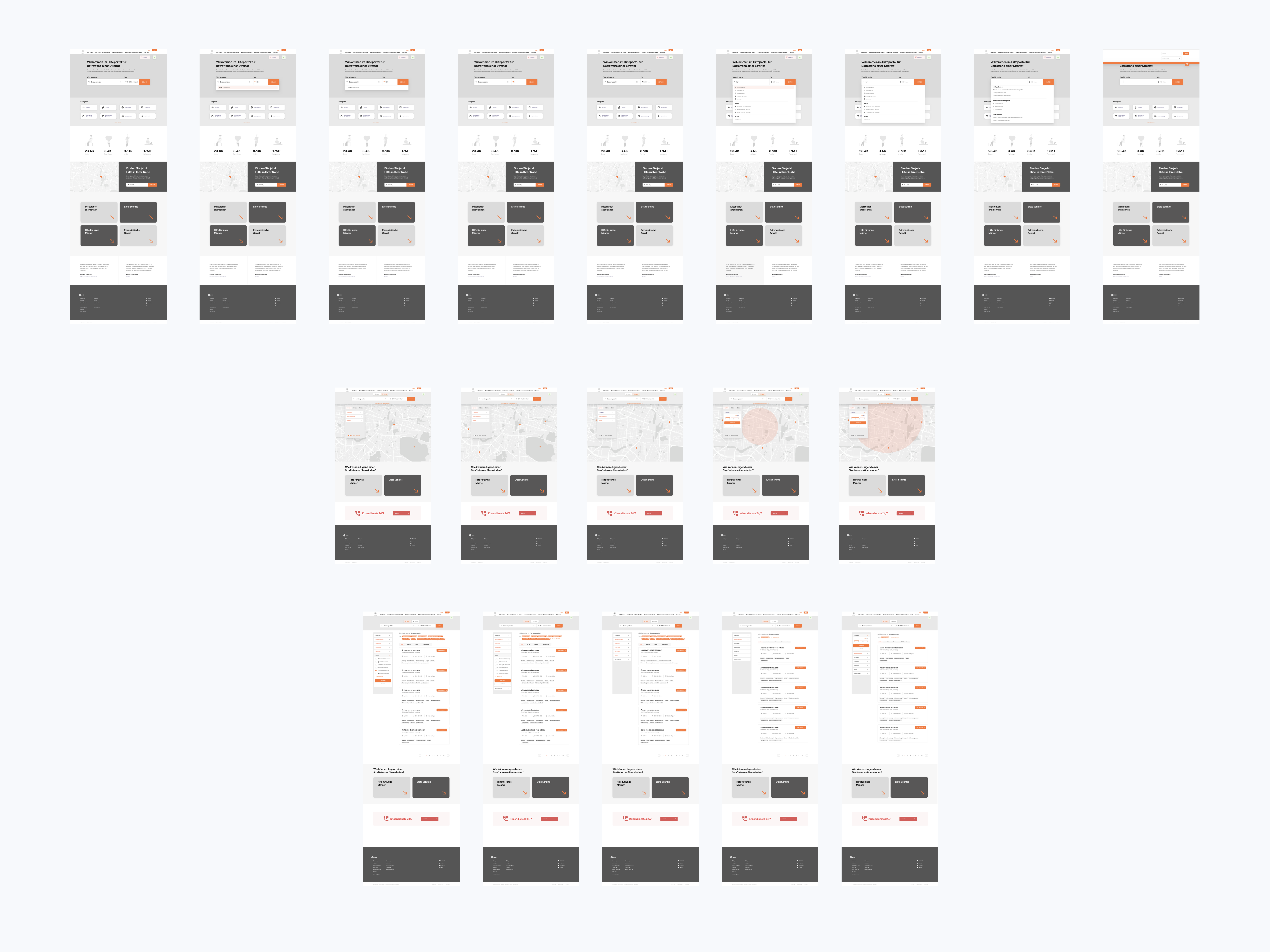
Designing the solutions
After the interviews, the creation of personas, and the customer journey maps, I was able to design more suitable solutions for the users/victims such as a smarter search, accessible content, or a more accurate map view to help victims wherever they are or more accessible access to resources.
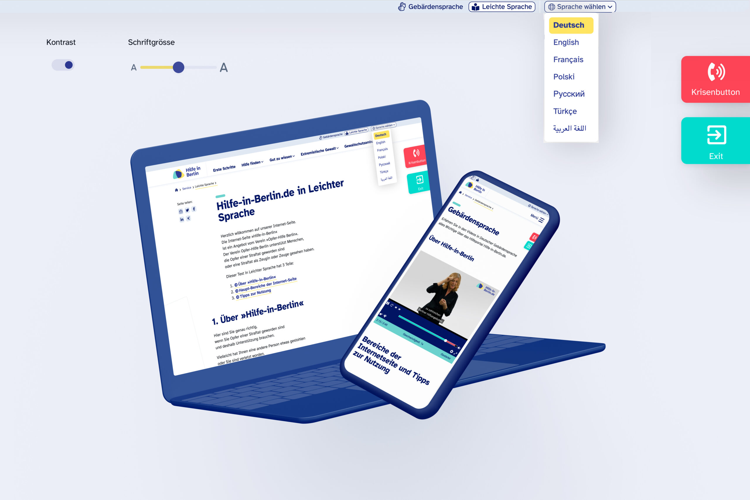
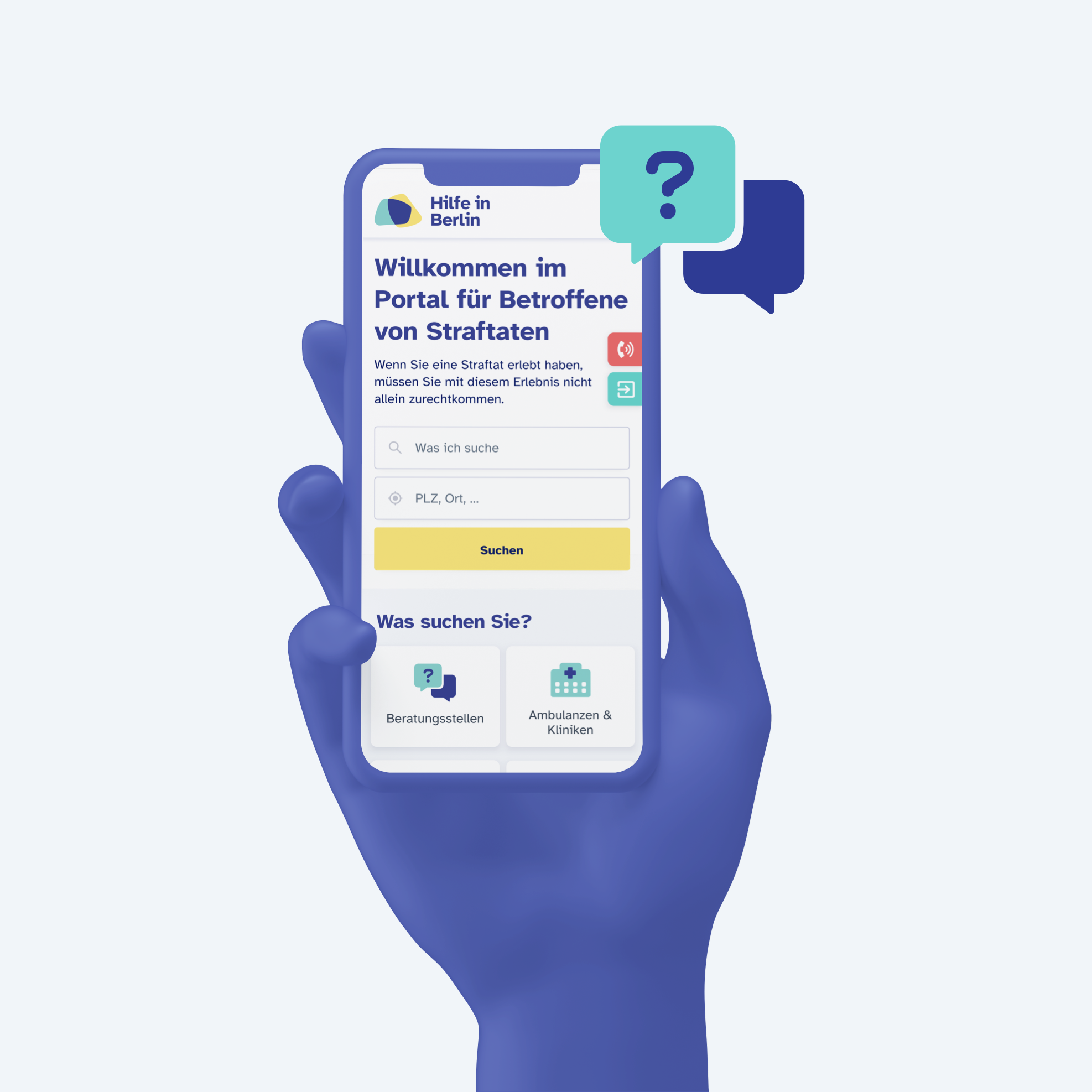
Accessible content, crisis and exit buttons
Thanks to user research, solutions were created for users such as displaying the content in 8 languages, in sign language, and in easy language.
Moreover, users will be able to adjust the contrast and size of the letters in order to help victims with any type of personal condition.
In addition, two buttons were added, reachable all the time: One with direct access to help in moments of crisis and another to leave the website without leaving a trace for possible aggressors.
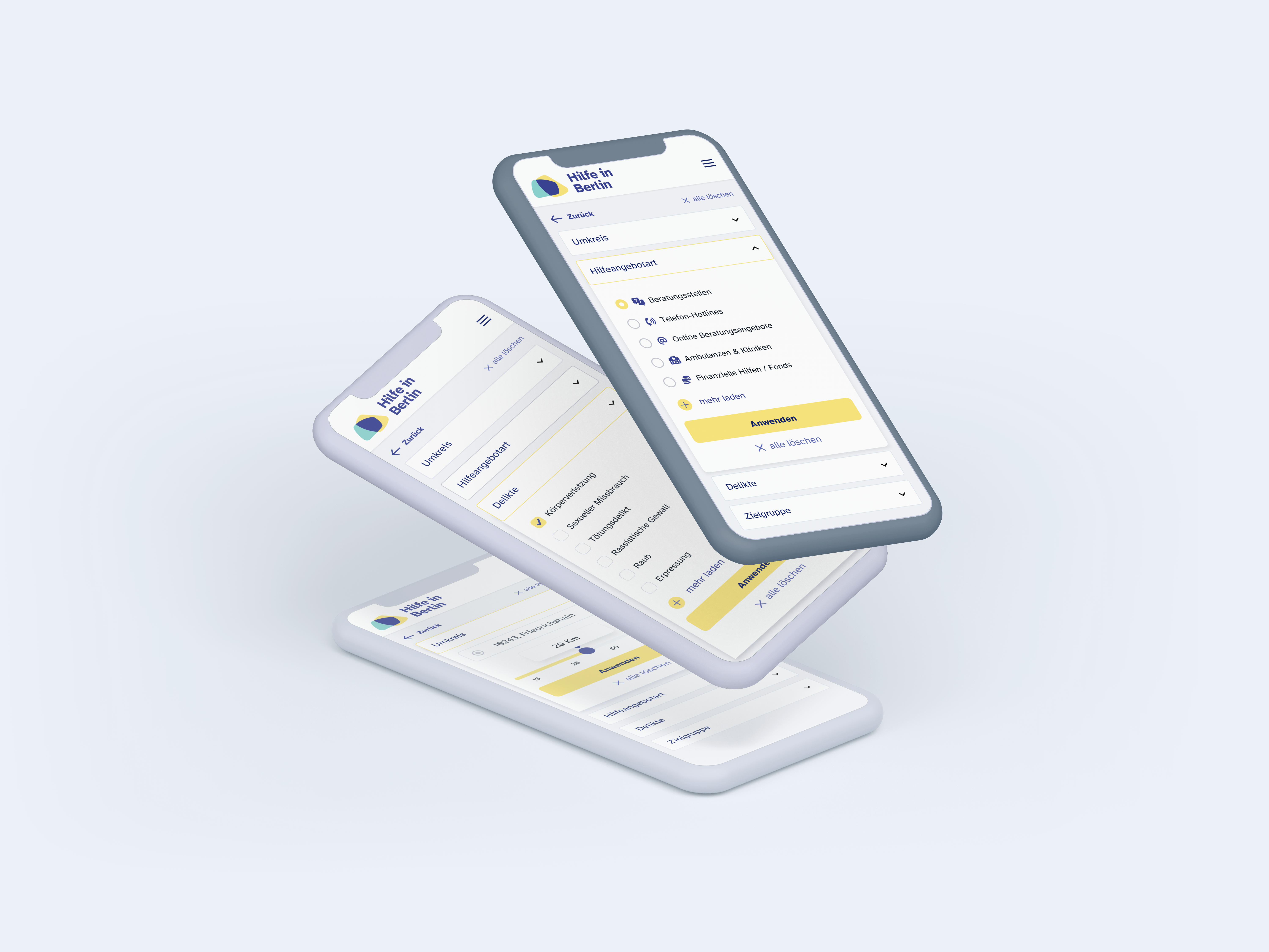
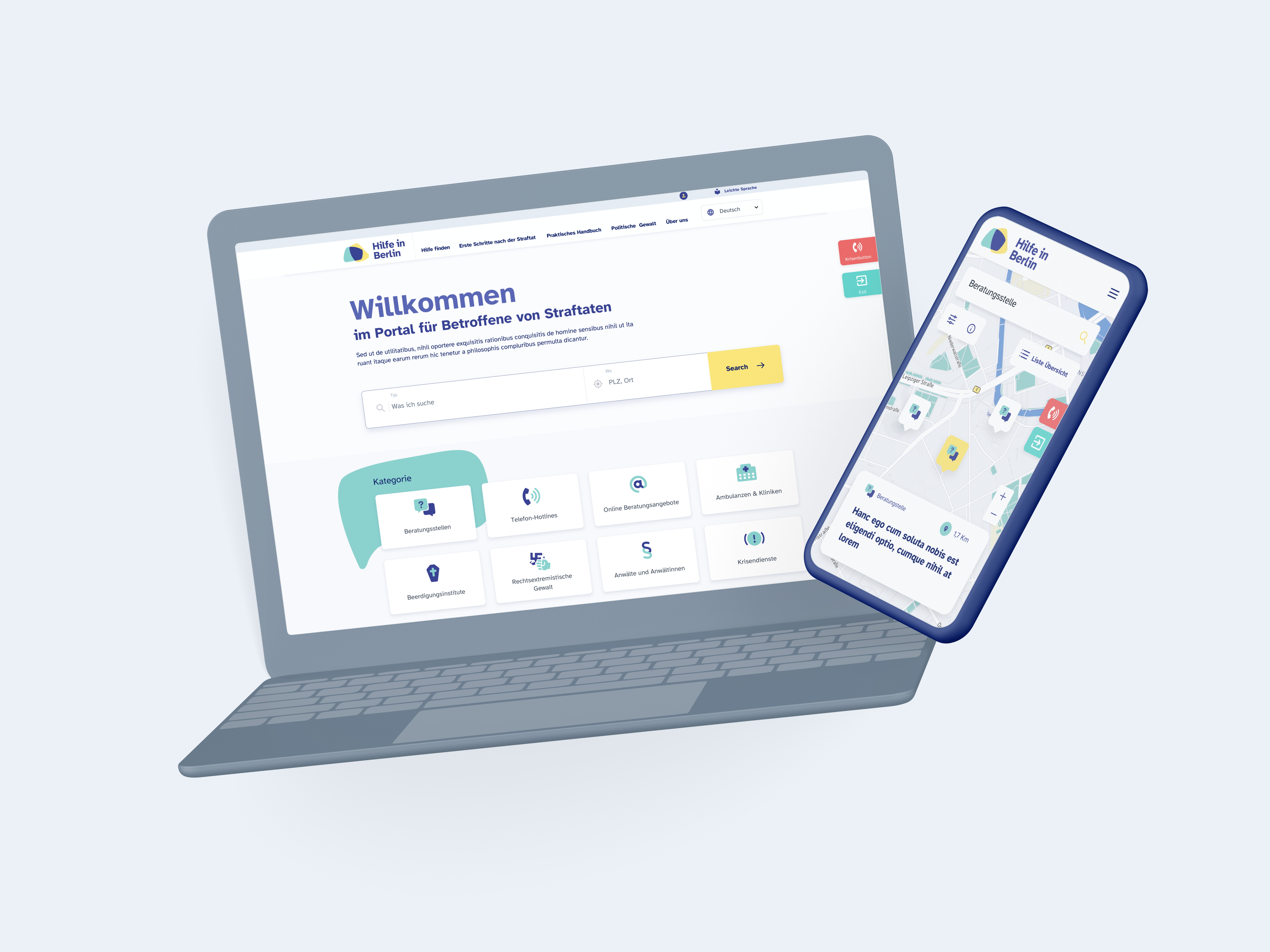
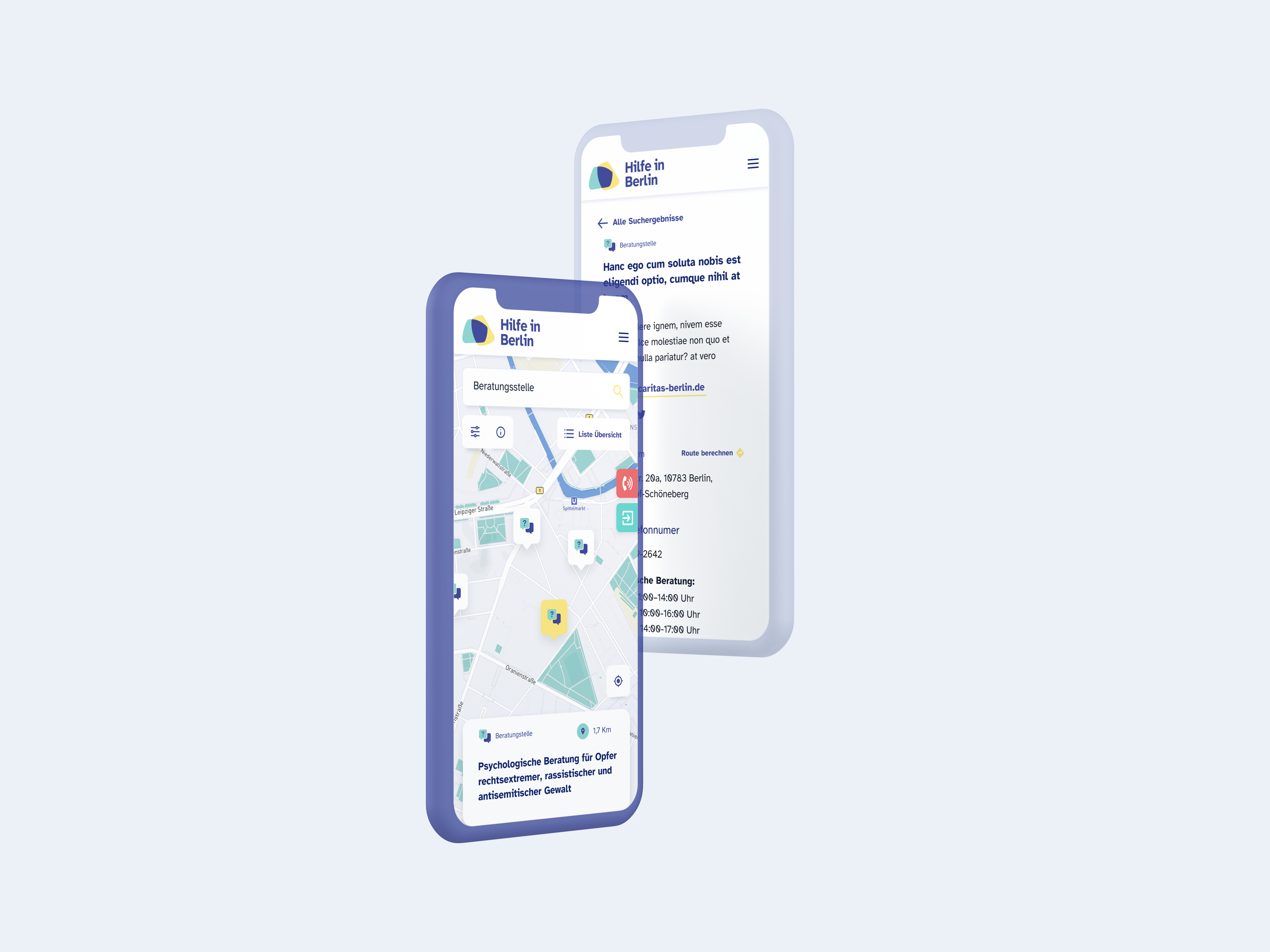
Search engine and filter efficiency.
The main search parameter is the name of most users’ needs. The results can also be easily adjusted with the filter system. Among them is the distance, type of case or languages.
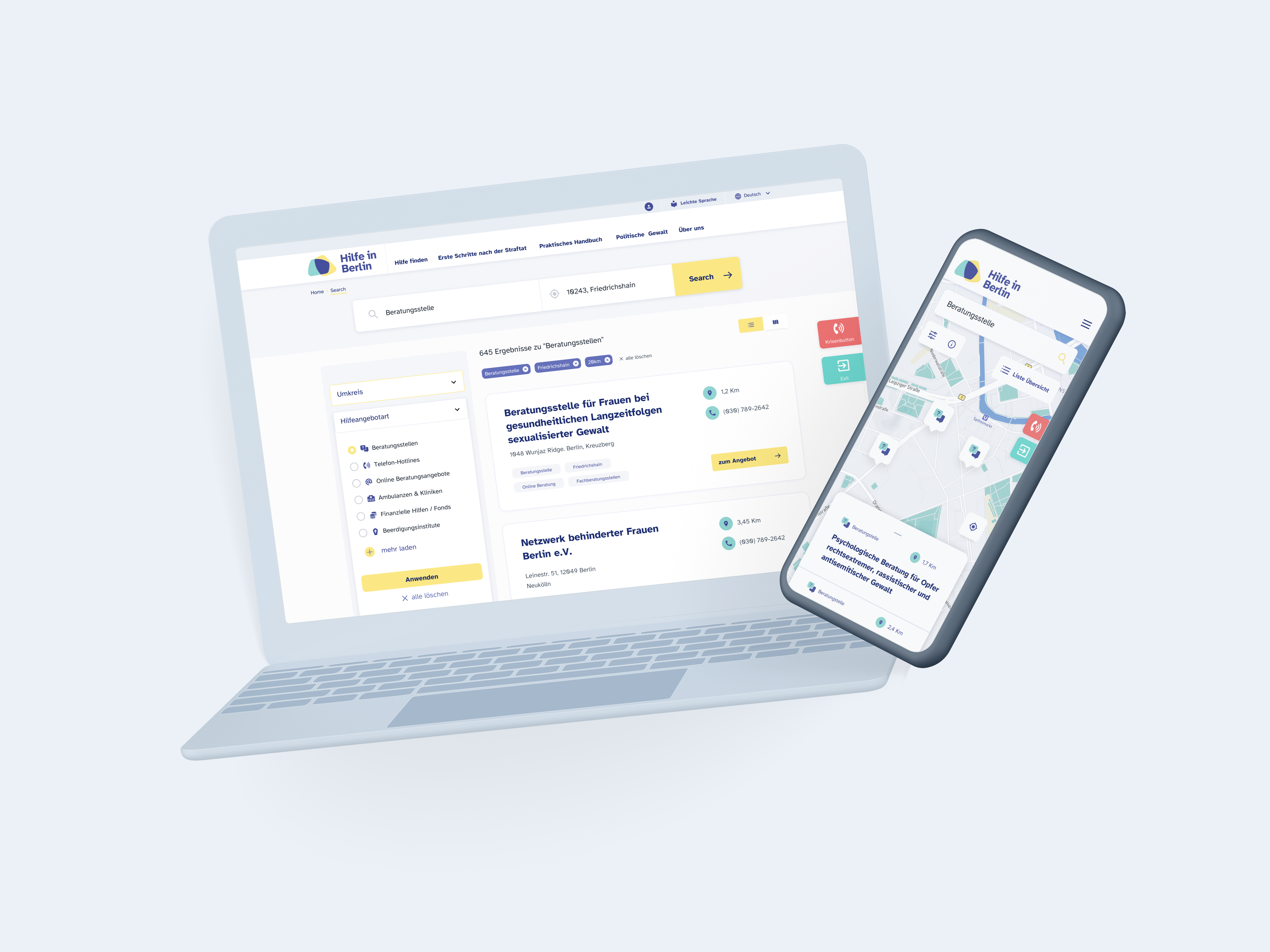
Map and list view
The help resources are Swipe up to see all the information about the results and swipe down to see the entire map. You can also switch to a list view with just one interaction offering help from local sources exactly when and where you need it.
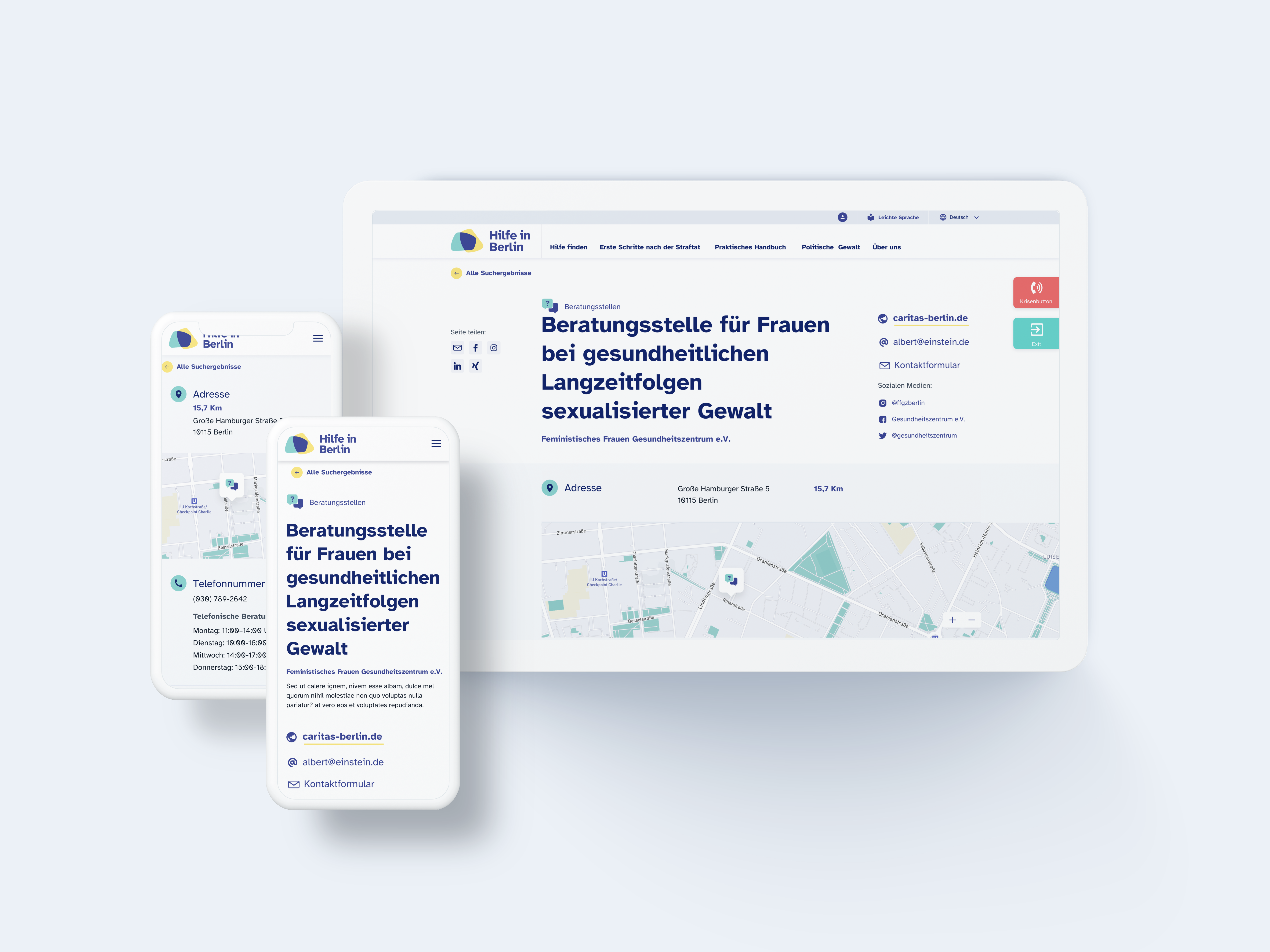
Detail Screen
The local support details page clearly and neatly displays relevant data for the victim to reach and how to do it, as well as interesting related information based on the search parameters.
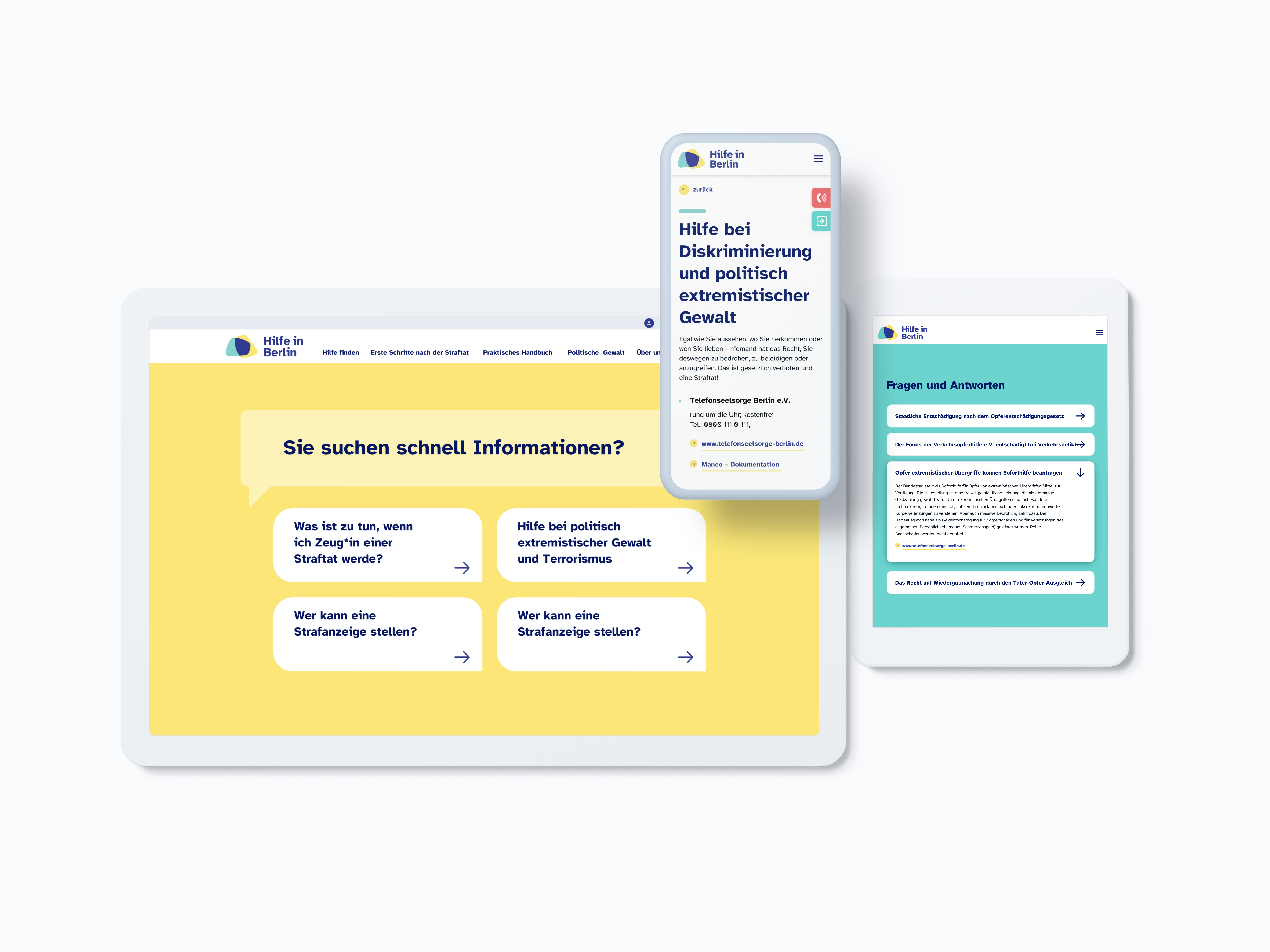
Smart accessibility of resources
The design of the experience smartly displays the support resources by formulating appropriate questions with the user search. The resources page is easy to access and provides additional information about resources in your area and how to contact them.
RTL design
Arab users will be able to understand the adaptation of the content from right to left and translated into their language.
Functional categories access
Accessibility Guidelines were applied to the interface elements to achieve a satisfactory user interaction experience.
Accessible Interface Design and Branding
The colors and icons created to redesign the brand are clean, neat and apply to the interface under Accessibility Guidelines. Users should have a visual experience in a context that is as comfortable and easy as possible.
The typeface is “Atkinson Hyperlegible”, which makes it different from traditional typography design in that it focuses on letterform distinction to increase character recognition, ultimately improving readability.
Branding and Interface
The final product
The final product design is a practical and functional help-finder portal that truly provides victims with the right information regardless of their language, disability, or personal situation.
Landingpage